Skull Kids: When Childhood Imagery Gets Its Edge Back
What makes a skull graphic tee worth wearing?
There's a particular kind of graphic design that doesn't announce itself. It earns attention slowly, the way a good record does — the more you look, the more you find. The Skull Kids Tee operates in that register. It isn't trying to shock you. It isn't trading on edginess for its own sake. It's doing something more considered: holding two opposing visual worlds in deliberate tension and asking you to sit with the contradiction.
Skulls in fashion have a complicated history. They've been co-opted so many times — by fast fashion, by band merch mills, by every high-street brand that needed a shortcut to 'dark' — that the motif carries a lot of baggage. Most designers sidestep it entirely now. The interesting question is what happens when you don't sidestep it, when you actually interrogate what a skull means in context. Pair it with youth iconography, with the visual grammar of childhood, and something shifts. The skull stops being a signifier of danger or rebellion and becomes something stranger and more resonant: a reminder that even the youngest, most vital things carry within them the full weight of time.
That's the territory the Skull Kids Tee is working in. And it's more interesting territory than it might first appear.
The Design Language at Play
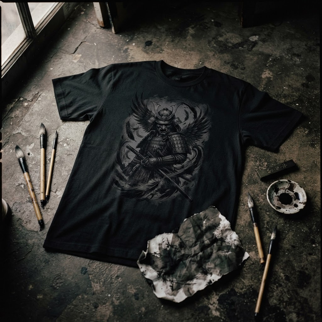
At the core of this piece is a collision of registers. Youth culture imagery — the kind of visual shorthand we associate with cartoons, playgrounds, early-nineties animation, the rough-edged innocence of childhood — placed in direct conversation with skeletal iconography. Not horror. Not gore. Skull as symbol, skull as archetype, skull as the thing that sits beneath every living face.
What makes this work graphically is restraint. The design doesn't lean into chaos. The line quality is deliberate, the composition structured. There's a confidence in the arrangement that suggests the designer understood exactly where to stop — a rare quality in bold print work. When illustration-based graphics go wrong, they usually go wrong because they try to fill every inch of available space, as if silence is something to be afraid of. Here, the negative space is doing real work.
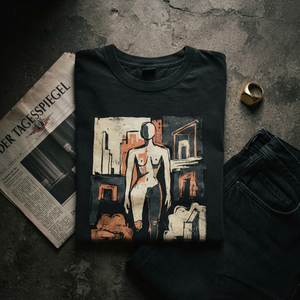
The colour palette, too, is worth noting. This isn't a design that relies on high-contrast shock tactics. The tonal choices are considered, giving the piece an almost vintage quality — like something you might find in a skate zine from 1994, or a hand-printed flyer that's been folded and unfolded so many times it's started to develop its own texture.
The Cultural Lineage
To understand where this kind of imagery comes from, you have to go back to the point where youth culture and counterculture first started genuinely influencing each other. The late eighties and nineties saw an explosion of designers — many of them coming out of skate and surf culture, others from the nascent streetwear scene in Japan and the US — who were deliberately fusing childlike aesthetics with harder, more confrontational symbolism.
This wasn't nihilism. It was something closer to philosophical mischief. The best work from that era understood that juxtaposition, done with skill, doesn't just create visual interest — it creates meaning. KAWS, before he became a blue-chip art market phenomenon, was doing exactly this: taking the warmth and familiarity of cartoon characters and running them through a filter of urban anxiety, mortality, and graphic sophistication. The result wasn't disturbing. It was oddly moving.
The Skull Kids Tee sits in that same lineage. It's not trying to reference KAWS, or any single artist — it has its own visual identity. But the underlying logic is familiar: childhood and death are not opposites. They're two points on the same line. Any design that understands this and builds from it starts from a more honest place than one that just wants to look cool.
Why Cotton Is the Right Canvas
There's something about this design specifically that demands to be worn rather than framed. The imagery has a looseness, a humanity to it that would feel cold and overworked behind glass. On cotton — particularly on a well-weighted, broken-in tee — it breathes. The texture of the fabric becomes part of the piece in a way that a poster or a print never quite achieves.
This matters more than people usually acknowledge. The best graphic tees in the world are designed with the substrate in mind. The way ink sits on cotton, the way a print ages and softens over repeated washes, the way a slightly heavier gram weight holds a bold design without buckling under it — these are considerations that separate a piece designed for print from a piece designed for wearing. The Skull Kids Tee reads like the latter. It has the proportions and the visual weight distribution of something built to move.
There's also the question of scale. The placement and sizing of the graphic feels intentional rather than templated. It doesn't overwhelm the garment, and it doesn't shrink into insignificance. It occupies the space with a kind of earned confidence.
Styling the Contradiction
The tension in the design gives you a lot to work with when it comes to wearing it. Because it's neither purely dark nor purely playful, it resists being pinned down by context. It can absorb a lot of different styling decisions without losing its identity.
Wear it with straight-leg denim and beat-up trainers and it leans into its skate-culture references without becoming a costume. Put it under a longer overshirt in a neutral — olive, sand, washed black — and the graphic becomes a glimpse rather than a declaration, which is often the more interesting way to carry a bold piece. Tuck it loosely into high-waisted trousers and the design sits differently again, more considered, more deliberate.
What it doesn't need is company. This is a tee that works best when the rest of the outfit steps back. Not because it's loud — it isn't, particularly — but because it rewards attention, and the best way to invite attention is to remove visual noise. Simple pieces, good fit, let the graphic do its work.
What Makes a Design Last
Most graphic tees have a shelf life. They're tied to a moment, a trend, a reference that makes complete sense in 2024 and feels slightly dated by 2026. The designs that endure tend to share certain qualities: they're rooted in something that doesn't expire, they have enough visual complexity to reward repeated looking, and they carry an emotional register that goes beyond pure aesthetics.
The Skull Kids Tee has a reasonable claim to that kind of longevity. The imagery it's working with — childhood, mortality, the strange beauty of things that carry contradictions — isn't going anywhere. These aren't trend references. They're something closer to universal preoccupations, the kind that artists and designers have been circling for centuries.
There's a reason the memento mori tradition has never really gone away. Not because people are morbid, but because there's something clarifying about being reminded that time moves, that youth is not permanent, that the things we love most are the things we should pay attention to right now. A good skull graphic, placed in the right context, does a version of that work. It isn't dark. It's honest.
The Skull Kids Tee understands this. And in a market full of graphics that are trying very hard to mean something, that understanding is rarer than it should be.
The Skull Kids Tee is available now in the T49 collection at t49.co.uk/product/455156557 — one of those pieces that earns its place the more you look at it. EXPLORE THE COLLECTION →