Born Race: When Speed Becomes a State of Mind
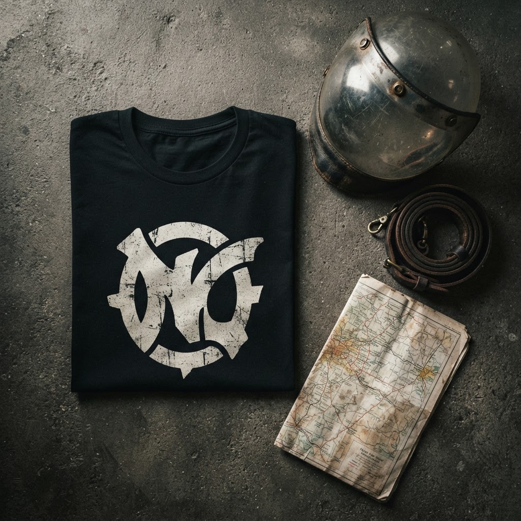
There's a certain kind of design that doesn't ask for your attention — it demands it. Not through noise or spectacle, but through the quiet confidence of something that knows exactly what it is. The Born Race Tee from T49 is that kind of piece. From the first glance, it communicates something primal: motion, drive, the sensation of being ahead of something you can't quite name.
But strip away the surface energy and you'll find a design rooted in something more considered than speed for speed's sake. This is a graphic built on contradiction — controlled chaos, stillness within velocity, restraint that somehow radiates force. It's the kind of tension that only works when the thinking behind it is sound.
This is the story of that thinking.
The Concept: Speed as Philosophy, Not Spectacle
The phrase 'Born Race' carries weight precisely because it refuses to be literal. It doesn't say 'race car' or 'born to race' — the grammar is compressed, truncated, almost aggressive in its economy. Two words that, placed together, suggest an entire identity rather than an activity. You weren't entered into a race. You were born one.
That compression is deliberate. In graphic design terms, what you leave out is as important as what you put in. The missing verb, the absent article — these aren't oversights, they're decisions. And those decisions shift the meaning from sport into something more like a worldview. It's the difference between a Nike slogan and a Raf Simons patch. One tells you what to do; the other tells you who you are.
The visual language surrounding that phrase follows the same logic. T49 designs tend to treat typography not as labelling but as architecture — the words are structural, load-bearing elements of the composition rather than captions sitting beneath the 'real' image. Born Race is no exception. The text and graphic exist in the same plane, the same tension.
The Visual References: What This Design Is Actually Drawing From
Look at this graphic and you're not really looking at motorsport iconography in the traditional sense — the chequered flags, the sponsor logos, the podium aesthetic. Those references exist in the culture, but Born Race is pulling from a different drawer entirely.
The lineage here is closer to early 1990s Japanese street graphics — the era when brands like Goodenough and Neighborhood were translating American workwear and biker culture through a Tokyo lens that made everything feel simultaneously foreign and urgent. There's also a trace of old European race posters: the Futurist obsession with velocity as a kind of spiritual condition, the idea that speed itself could be beautiful and dangerous in equal measure.
Futurism — the Italian art movement of the early twentieth century — was genuinely fascinated by the aesthetics of machines in motion. Artists like Giacomo Balla painted speed lines not as background detail but as the subject itself. That energy, that belief that motion is expressive, runs quietly through the DNA of Born Race without the design ever needing to announce its references.
This is what separates thoughtful streetwear graphics from generic licensed apparel. The reference doesn't have to be visible to be felt.
Why Cotton? The Medium as Part of the Message
There's a reason that the most culturally significant graphics of the last fifty years have been printed on t-shirts rather than framed on gallery walls. The Tee is democratic, ephemeral, and intimate in a way that canvas never is. It moves with you. It ages with you. It exists in public space on a body, not in controlled light behind glass.
For a design like Born Race, the cotton ground matters. The graphic needs a surface that absorbs it rather than repels it — something that gives the print a slightly organic quality, edges that breathe rather than cut. A Tee lets a design like this feel worn-in even when it's new. It carries weight without being precious.
T49's approach to print on fabric treats the garment as a medium with its own aesthetic properties — not just a vehicle for displaying a design, but a collaborator in how that design is ultimately read. A bold, high-contrast graphic lands differently on the soft give of jersey cotton than it would on, say, a poster or a screen. The slight imperfection of fabric — the way it drapes, the way it catches light differently depending on how it folds — gives Born Race a presence that's alive in a way flat digital artwork simply isn't.
This is why certain designs only make sense as t-shirts. Born Race is one of them.
The Cut: Design That Doesn't Negotiate Gender
The word '' has been diluted almost to meaninglessness by a decade of fast fashion appropriating the language of inclusivity. But in a design context, means something specific: a silhouette and a graphic that were conceived without a gendered wearer in mind. Not 'men's fit with a slightly longer hem' — genuinely genderless in its intent.
Born Race works as a piece because the graphic itself is genderless. There's nothing in the imagery or the typography that codes for a particular body or identity. The energy it carries — that compressed urgency, that sense of forward momentum — reads the same regardless of who's wearing it. Which is, of course, the point.
In street culture, the most enduring graphics have always transcended the demographic boxes that retail tries to put around them. The best band tees, the most iconic skate graphics, the vintage rally and moto prints that still circulate on resale platforms — none of them were designed with a target customer in mind. They were designed with an idea in mind. Born Race lives in that tradition.
Wearing Something That Moves
There's a particular kind of piece in any wardrobe that changes the energy of whatever you put it with. Not because it's loud — it might be the opposite of loud — but because it carries a specific quality that shifts the register of an entire outfit. Born Race is that piece.
Styled with heavy denim and worn boots, it reads as something European and slightly industrial — the kind of thing you'd see on the back streets of Berlin or Marseille. Layered under an open overshirt in a muted technical fabric, it becomes something more considered, the graphic framed rather than displayed. Worn alone in a warmer context, it's immediate and direct — no mediation, just the image and the person.
This versatility isn't accidental. It's the result of a graphic that has genuine compositional integrity — a design that holds its own regardless of context because it was built on ideas rather than trends. Trend-driven graphics date themselves in real time. Concept-driven graphics tend to get better with age, the way a good song reveals new layers on repeated listening.
The T49 Philosophy: One Design, Fully Considered
T49 doesn't operate like a catalogue brand — releasing volume in the hope that something catches. The approach is closer to an editorial one: each design exists because someone thought hard about whether it should exist, what it's saying, and whether the graphic execution is equal to the idea behind it.
Born Race is a useful lens for understanding that philosophy. On the surface, it might read as a bold graphic tee in a competitive market full of bold graphic tees. But look closer and you find the compression of language, the layered cultural references, the respect for the cotton ground, the genderless graphic intelligence — none of which happen by accident.
The designs that endure in street culture are always the ones that had a point of view from the beginning. Not a marketing angle or a trend forecast, but an actual perspective on something. Born Race has a perspective. It believes that velocity is a state of mind, that urgency is a design quality, and that sometimes the most powerful thing a piece of clothing can do is make you feel like you're already moving — even standing still.
From the Collection
The Born Race Tee is available now in the T49 collection at [/product/453554569](/product/453554569).
Explore the drop →