
Respawn Culture: The Visual Language of the Gamer Tee
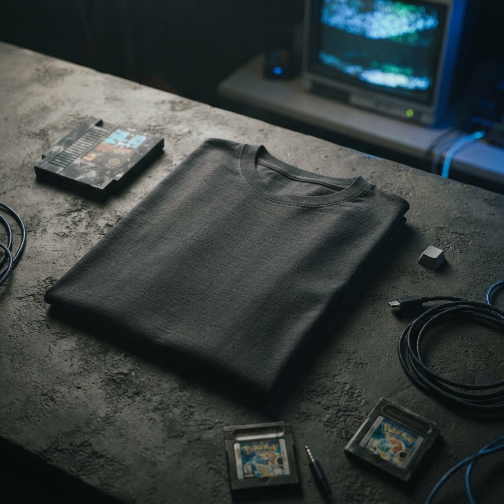
There's a generation that grew up speaking two languages. One was spoken. The other was visual — built from pixel grids, loading screens, controller prompts, and the particular glow of a CRT monitor at midnight. That visual language never really went underground. It just waited for fashion to catch up.
The T49 Gamer tee is not nostalgia bait. It's not a licensed logo slapped on a blank. It's a considered piece of graphic design rooted in a culture that has shaped the way an entire generation thinks about aesthetics, narrative, and identity. And it sits on cotton the way good print should — with authority.
This is the story of one design. Where it comes from, why it works, and what it means to wear it.
The Pixel as a Design Primitive
Long before lo-fi became an aesthetic category, games were solving a very specific design problem: how do you communicate complexity, personality, and emotion through the most minimal visual unit possible? The pixel was the answer. And what emerged from that constraint was one of the most distinctive visual languages of the late twentieth century.
There's a reason pixel art still resonates. It's not just about nostalgia for old hardware — it's about the elegance of limitation. Every pixel placed was a deliberate choice. No gradient could save a bad composition. No photorealism could substitute for genuine visual thinking. Pixel art demanded that you understand form, colour, and contrast at their most reduced.
The Gamer tee draws from that tradition. The graphic carries that same economy of line and intention that makes pixel-influenced design immediately legible — and immediately interesting. On cotton, this kind of visual precision lands differently than it does on screen. The texture of the fabric becomes part of the composition, grounding digital-born imagery in something physical and tactile.
A Culture That Was Always Visual
Gaming culture didn't borrow its aesthetic from anywhere. It generated its own. The box art of early console releases, the dense iconography of arcade cabinets, the hand-drawn instruction manuals that came tucked inside cartridge sleeves — all of it was building a visual vocabulary from scratch, largely outside the mainstream design world.
That autonomy produced something singular. Gaming graphics weren't filtered through advertising agencies or design schools. They came from programmers moonlighting as artists, from illustrators working within constraints so tight they bordered on absurd, from designers who had to make a face recognisable in sixteen by sixteen pixels. The results were strange, inventive, and often genuinely beautiful.
The Gamer tee taps into that lineage. There's an honesty to the visual reference — a respect for where the imagery comes from rather than a cynical lift of surface aesthetics. This isn't gamer-adjacent. It's the real thing, translated for cotton with the care it deserves.
Why Screen Culture Works So Well on a Tee
Graphic tees have always been the medium for subcultural self-identification. Before social media, before profile pictures, the tee you wore was your signal — to others who were paying attention, it was a coded message about what you cared about, what you knew, what world you moved in.
Gaming culture understood this instinctively. The screen and the street have more in common than they're usually given credit for. Both are spaces where identity is performed, where visual codes carry weight, where belonging is expressed through what you choose to display.
Printing gaming iconography on a tee isn't a translation from one medium to another. It's a homecoming. The visual language of games — bold outlines, high contrast, strong symbolic imagery — was always built for impact at a glance. Which is exactly what a great graphic tee needs to do. You have maybe two seconds of visual attention. The design has to work immediately and reward longer looking. The Gamer tee does both.
Unisex by Design, Not by Default
The unisex cut matters here. Not as a commercial decision but as an aesthetic one. Gaming culture, despite its complicated history with gender politics, has always had its most interesting communities exist outside rigid categories. The spaces where the culture was genuinely creative — the zine makers, the speedrunners, the modders, the fan artists — were never particularly bothered by who you were or how you presented.
A tee that's genuinely cut for everyone carries that same openness. The fit works across body types because the design was conceived that way from the start, not retrofitted into a unisex cut as an afterthought. The graphic sits right. The weight of the cotton drapes right. It's a piece that belongs to anyone who feels the reference.
This is part of what separates a considered design from a product. A product gets made. A design gets thought about.
The Weight of the Cotton
There's a conversation that rarely gets had about what makes a graphic tee actually work as a wearable object. People talk about the print, the concept, the cultural reference. What they often skip is the cotton itself.
The Gamer tee is built on fabric that has physical presence. Not the tissue-thin stock that makes a good image look cheap the moment you pick it up, but cotton with genuine weight and structure — the kind that holds its shape after repeated washing, that develops a character with wear rather than collapsing into a rag.
This matters because graphic design on a tee is not the same as graphic design on a screen or a poster. The substrate changes everything. Ink on heavy cotton behaves differently — it has depth, it interacts with the weave, it becomes part of the fabric rather than sitting on top of it. When the design is good and the cotton is right, the result is something that improves with age. The Gamer tee is that kind of piece.
Reading the Room: When Gaming Culture Hits the Street
There's a version of gaming-referential fashion that's essentially cosplay. Logo tees, character likenesses, franchise branding. That world exists and it has its audience. But it's not what's interesting.
What's interesting is when the visual grammar of gaming is absorbed so deeply that it starts to influence how designers think about form, colour, and composition in ways that aren't explicitly about games at all. The flatness. The deliberate use of outline. The preference for symbolic imagery over realist representation. These are design sensibilities that emerged from screen culture and have quietly migrated into streetwear, into independent publishing, into illustration, into typography.
The T49 Gamer tee sits at that intersection. It's identifiable without being a billboard. It communicates clearly without explaining itself. People who know, know. People who don't see a strong piece of graphic design on a well-made tee. Both readings are valid. That's the mark of a design that's operating on more than one level.
Wear it with whatever you wear. The tee is doing its own work.
From the Collection
The Gamer Unisex t-shirt is available now at T49 — find it here: /product/453756867
Explore the drop →