Dead Reckoning: Why the Skull Kids Tee Belongs in the Conversation
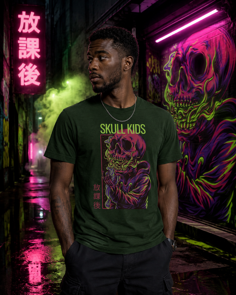
There's a reason the skull never goes out of fashion. Not in street culture, not in graphic design, not in the visual language that connects punk records to skate decks to gallery walls. It's one of the oldest symbols in human history, and yet somehow every generation manages to find something new to say with it. The question is always the same: what are *you* saying with it?
T49's answer, with the Skull Kids Tee, is more layered than a first glance might suggest. This isn't a grim reaper exercise or a heavy metal throwback. It's something more playful, more culturally aware — and in that tension between dark iconography and youthful energy, it finds its own voice entirely.
That push and pull between innocence and edge is exactly where the most interesting graphic design tends to live. And it's where this piece sits.
The Graphic Language at Work
Skull imagery in design has always functioned as a kind of cultural shorthand. From Alexander McQueen's silk scarf prints to Rick Owens' architectural brutalism, from Stüssy's early-90s underground prints to BAPE's Ape Skull pieces, the motif has been stretched, subverted, and recontextualised across decades and disciplines. What changes is the register — the tone in which the symbol speaks.
The Skull Kids Tee operates in a register that's distinctly its own. The word "Kids" in the title isn't incidental — it's the conceptual hook. It positions the skull not as something menacing but as something reclaimed by youth. Think of the way kids have always adopted symbols that adults find uncomfortable: the way a skull patch on a school bag is an act of low-level rebellion, the way cartoon aesthetics have long been used to disarm darker themes in graphic art.
This design understands that language. It's in conversation with the tradition of artists like KAWS, who built an entire visual world by injecting the unsettling into the friendly, or Futura, who understood that abstraction could carry weight without spelling everything out. The graphic here doesn't shout. It holds its ground quietly, which is often the more confident move.
Where It Sits in Street Culture
Street culture has always had a complicated relationship with mortality imagery. From the skull-heavy early work of graffiti writers tagging their names across city infrastructure — a symbolic staking of existence — to the prevalence of the motif in Japanese streetwear, where Harajuku culture fused cute and macabre into something entirely distinct, the skull has functioned as a kind of universal passport across subcultures.
What makes the Skull Kids Tee feel current rather than derivative is its awareness of that history without being enslaved to it. There's no attempt to replicate a specific era or scene. Instead, it draws from the well of that collective visual vocabulary and produces something that feels at home in 2024 — a piece that a vintage-collector type and a graphic design student could both appreciate without either feeling like they're wearing the other's uniform.
That cross-subcultural legibility is genuinely hard to achieve. Most graphic tees either go too niche — legible only to insiders — or too broad, losing all their edge in the process. The Skull Kids Tee finds the frequency where those two impulses overlap, which is exactly where the most enduring street pieces tend to live.
It's the kind of graphic you see and clock immediately, even across a crowded room. Not because it's loud, but because it's considered.
Craft, Construction, and Why It Matters
A graphic is only ever as good as what it's printed on. This is something the industry has historically been bad at acknowledging openly — that the relationship between image and fabric is fundamental, not incidental. The wrong weight of cotton, the wrong finish, and a great graphic becomes a forgettable tee.
The Skull Kids Tee is built on a foundation that takes that relationship seriously. The cotton carries the kind of weight that gives a t-shirt presence — it sits on the body rather than clinging to it, holds its shape through repeated washes, and provides the kind of surface that allows the graphic to breathe without feeling stiff or plasticky. The result is a piece that wears in rather than wearing out, developing that softness over time that marks the difference between a tee you rotate through and one that becomes a permanent fixture.
The cut is considered rather than trend-dependent. Proportions that work with the graphic rather than fighting it — enough length, enough shoulder, enough room in the body to layer without losing the silhouette entirely. It's a fit that understands how people actually dress rather than how brands wish they would.
Sizes run from S through to 2XL, which reflects a genuine understanding that streetwear's audience isn't a single body type, and that fit preference varies as much as graphic taste.
The Case for Graphic Tees as Design Objects
There's a tendency — even within streetwear — to treat graphic tees as the entry-level tier, the accessible product sitting below the outerwear and the more complex constructions. That framing misses something important. The graphic tee is one of the purest design formats in existence: a single surface, a single image, no structural complexity to hide behind. Either the graphic works or it doesn't. Either it carries meaning or it's just noise.
The Skull Kids Tee works. It carries meaning without overexplaining itself, references without imitating, and holds its own within a longer conversation about what graphic design has meant to street culture since the format invented itself in the late 20th century.
That's not a small thing. That's the whole point.
The Skull Kids Tee is available now in the T49 collection, in sizes S through 2XL.
From the Collection
The Skull Kids Tee is available now in the T49 collection, in sizes S through 2XL.
Explore the drop →