Three Ways To Wear A Minimal Line-Design Tee Without Losing The Edge
There's a particular kind of restraint in line-based graphic design that takes real confidence to wear. Not the confidence of wearing something attention-grabbing — anyone can do that — but the confidence of wearing something that rewards a second look. A design that doesn't announce itself but holds its ground the longer you study it.
Minimal line-design tees occupy a specific, interesting position in the wardrobe. They're not the blank canvas of a plain white tee, and they're not the visual noise of a maximalist print. They sit in between: considered, precise, carrying meaning that doesn't flatten out at arm's length. The challenge, and the opportunity, is building looks that respect that tension rather than resolve it too quickly in either direction.
The following three approaches aren't rules. They're starting points — each built around a different context, a different mood, and a different understanding of what minimal graphic design actually does when it moves through the world.
Wear It Loose, Wear It Alone: The Case For Doing Less
The first and most important thing to understand about a well-constructed line-design tee is that it usually doesn't need help. The instinct to layer, to accessorise, to build context around a graphic piece is strong — and sometimes correct — but with minimal work, less architecture around the tee is almost always better.
Start with fit. An oversized drop-shoulder cut lets the graphic sit without pressure, the lines of the design reading clearly across the chest rather than distorting across pulled fabric. Pair with wide-leg trousers — not necessarily joggers, but something with weight and drape. Linen-cotton blends work particularly well here because they carry the same idea of simplicity under pressure that a good line drawing does: the material breathes, holds shape loosely, doesn't perform.
Footwear is where you decide the register. Clean low-profile trainers — unadorned, single-coloured — keep the whole thing street without leaning casual. White canvas or washed grey suede. Nothing with branding that competes. The tee is the only text in the room.
Colour discipline matters here more than anywhere else. When the graphic is minimal, the surrounding palette should confirm that choice rather than contradict it. Monochromatic or near-monochromatic dressing — black tee, off-black trousers, charcoal accessories — creates a kind of visual silence that the line work cuts through cleanly. The design becomes the only thing with anything to say, and that's exactly where you want it.
The Layering Play: Keeping The Graphic Visible
Layering a graphic tee is an exercise in editorial judgment. Layer too heavily and the design disappears entirely — at which point you're just wearing the fabric, not the idea. Layer too little and you haven't added anything. The goal is partial visibility: enough coverage to add dimension, enough exposure to keep the print in the conversation.
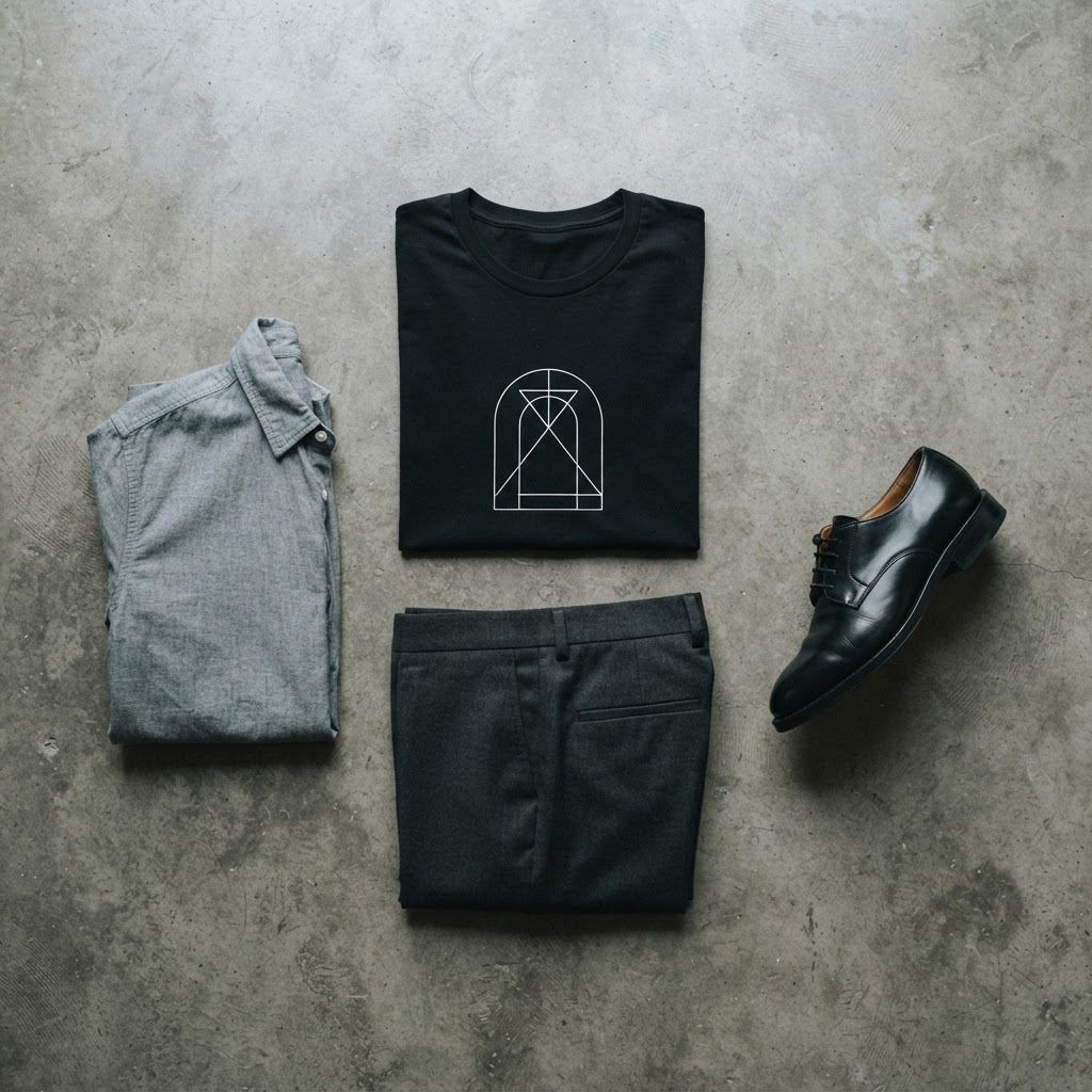
An open overshirt — chambray, light twill, washed cotton — worn fully unbuttoned is probably the most reliable tool here. The shirt frames the tee rather than covering it. The graphic sits centred in that open frame, visible and contextualised rather than competing with the outer layer. The key is weight: the overshirt should be lighter than the tee, or at minimum the same weight, so the tee stays visually dominant.
For a sharper version of this approach, a lightweight technical jacket — something structured but not padded — worn open over the tee introduces a different texture conversation. The line drawing on the tee and the seam lines of the jacket start to echo each other in an interesting way, particularly if the jacket has clean, minimal detailing. This isn't accidental coordination; it's a coherent design sensibility applied across categories.
Trousers in this layered register can move slightly more formal without the look becoming confused. Straight-cut tailored trousers in a mid-weight fabric — navy, stone, dark olive — read as intentional dressing rather than casual default. The graphic tee anchors the informality without undermining the structure. This is the look for evenings when the context is ambiguous and you'd rather be slightly over-considered than under.
The Alien Invasion Unisex t-shirt from T49 — a piece built around precise, economical line work — functions particularly well in this layered context. The clean geometry of the graphic holds its own under an open jacket in a way that a busier print never quite manages.
Contrast Dressing: When The Tee Is The Disruptor
The third approach is the most interesting, and the one that most people don't attempt because it requires accepting a certain amount of tension. The idea is to place the minimal line tee into a more formal or structured context and let it function as the deliberate interruption in an otherwise composed outfit.
This works because minimal graphic design has an inherent credibility that maximal design sometimes lacks in formal settings. A single, precisely drawn image — a line-work figure, a geometric form, an architectural motif — reads more like wearable art than printed merchandise. It doesn't clash with structure; it questions it, which is a more interesting outcome.
The application: wear the tee tucked into tailored trousers with a visible crease. Add a single-button blazer, unlined if possible, in a neutral that complements rather than matches the tee. The blazer goes on. The tee stays visible at the collar, at the chest. The graphic is framed by lapels, which is an unusual context for any printed piece, and that unusualness is the point.
Shoes here should commit to the formality rather than hedging toward casual. A clean leather derby or a minimalist Chelsea boot holds the look together in a way that a trainer would undercut. The graphic tee has already disrupted the register; the footwear's job is to confirm that the disruption was intentional.
This approach works specifically because the line design is minimal. A complex illustrated print in the same setting reads as underdressed. A single, well-drawn image reads as a choice. The difference is the level of visual noise — and minimal line work produces almost none.
Understanding What Minimal Design Actually Does
Before building any of these looks, it helps to understand why minimal line-design graphics operate differently from other printed tees. The answer is largely about cognitive load. A dense, highly detailed graphic asks a lot of the viewer — there's information to process, a hierarchy to read, a visual entry point to find. A clean line drawing offers almost none of that friction. The image is immediate, and so the response to it is more direct.
This directness is a design achievement, not a shortcut. Reducing an idea to its essential lines — removing everything that isn't necessary — is significantly harder than adding detail. The best minimal graphics are the result of decisions about what to leave out, which is a different and arguably more demanding creative process than deciding what to include.
When you wear a piece like that, the simplicity you're carrying isn't emptiness. It's the result of someone removing everything that wasn't essential until only the image remained. That's worth understanding, because it changes how you approach the styling. You're not filling a gap with clothing. You're building a context for something that's already resolved.
Fabric And Weight: The Underrated Variable
The physical qualities of the tee matter more with minimal graphics than with complex ones. A heavy-weight cotton with a tight weave holds the shape of a line drawing better than a thin jersey — the fabric doesn't distort under wear, the print surface stays flat, and the weight of the garment contributes to the sense of permanence the graphic is trying to project.
Colour of the base fabric is similarly important. Black gives line-work graphics the most contrast and the highest visual clarity — the lines read sharply, the image holds from a distance. White gives a different quality: the graphic feels more exposed, more present on the surface rather than emerging from depth. Both work, but they produce different readings of the same image.
Natural fibre content also changes how the tee ages. A cotton-rich fabric develops character over time — the fabric relaxes, the colour softens slightly, the garment becomes more individual. For a minimal line-design piece, this is a quality rather than a flaw. The image becomes yours in a way that fast-fashion prints, which typically crack and fade uniformly, never quite achieve.
The Edit: What To Leave Out
Every styling guide should end with what not to do, because that's usually the more useful information.
Don't double up on graphics. A line-design tee worn with a heavily branded or printed outer layer produces visual competition that neither piece wins. Pick one graphic element per look — the tee is it.
Don't over-accessorise. A chain, a watch, a bag — fine. Rings and bracelets and layered chains and a bucket hat simultaneously turns the accessory context into its own argument, and the tee gets lost in the noise.
Don't fight the palette. If the tee is black with white line work, the surrounding pieces should have a clear relationship to that — not necessarily matching, but not contradicting. A bright colour worn carelessly near a minimal graphic reads as an accident rather than a decision.
And don't confuse minimal with simple. The tee isn't simple. It's edited. Dress accordingly.
From the Collection
The Alien Invasion Unisex t-shirt is available now at T49 — clean line work on a heavyweight base, built to hold its shape in exactly the looks described above. /product/453547661
Explore the drop →