Why 90s T-Shirt Graphic Design Refuses to Stay Dead
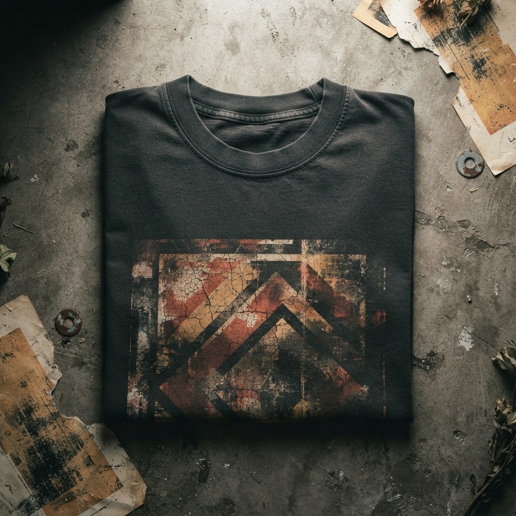
There's a particular kind of graphic tee that stops you in your tracks. The image is bold, slightly unhinged, printed on a cotton that feels heavier than it should. The colours are either washed to near-oblivion or aggressively saturated — no middle ground. You've seen it before, except you haven't. It feels familiar in the way that a memory feels familiar: not quite yours, but close enough to claim.
That's the 90s graphic tee in 2025. It's everywhere and nowhere at once. It's in the vintage rails of East London markets, in the lookbooks of independent labels, in the heavyweight blanks being screen-printed in small runs across Manchester, Los Angeles, and Tokyo. The decade that gave us grunge, rave culture, and the first wave of streetwear as a legitimate design language has never really let go — and the question worth asking is why.
The easy answer is nostalgia. But that's too convenient, and honestly too lazy. Nostalgia explains trend cycles. It doesn't explain why certain visual languages from one specific decade keep reappearing with more force than anything that came before or after. For that, you need to look at what 90s graphic design actually was — and what it was doing that most design eras never managed.
The Decade That Broke the Rules and Made New Ones
The 1990s were, graphically speaking, a period of genuine chaos — and that chaos was the point. Coming out of the clean geometry and corporate neon of the 80s, designers in the early 90s deliberately destabilised. Type got distorted. Images got layered, scratched, photocopied into abstraction. Composition stopped following rules about balance and hierarchy. The visual culture of grunge, hip-hop, skate, and rave all collided in a period of roughly ten years, and the t-shirt was the primary canvas for all of it.
What made 90s graphic tees distinctive wasn't just the aesthetic — it was the attitude. These weren't designs built to be universally legible or brand-safe. They were confrontational, specific, sometimes deeply weird. A band tee from 1994 might feature imagery that made no obvious narrative sense. A skate brand tee might lean into occult imagery or horror iconography with zero explanation. The designs assumed that the wearer understood the language — and if they didn't, that was fine too. The graphic existed on its own terms.
This self-contained visual logic is rare. Most eras of design are self-conscious — aware of being watched, anxious to communicate clearly. The 90s were not. They were designed for subculture insiders first and mainstream audiences a distant second, which is precisely why they aged so well. What reads as opaque or strange at the time tends to read as mythological later.
Screen Printing, Imperfection, and the Value of the Handmade Mark
There's also a technical dimension to this that doesn't get discussed enough. Most 90s graphic tees were screen printed, and screen printing at scale during that era had a quality — some would say a limitation — that is now actively sought after. Ink sat thick on fabric. Registration wasn't always perfect. Colours bled slightly at the edges. Over washes, the print would crack in ways that weren't designed but became part of the object.
This material imperfection is something that digitally-optimised modern printing can't replicate cleanly. When brands now chase the 90s aesthetic, they're chasing a physical quality that came from a production method with its own inherent character. The distress, the bleed, the heaviness of ink — these weren't design decisions, they were byproducts. And they became inseparable from the feeling of the era.
The current appetite for heavyweight cotton, for oversized blanks, for prints that look like they've been through something — it's a direct response to years of thin fast-fashion tees printed at minimum cost for maximum volume. The 90s tee represents the opposite of that: an object with weight, with visual density, with a print that doesn't look like it was generated by an algorithm optimised for conversion rates.
Warrior Culture and the Power of the Archetype
One of the most durable threads running through 90s graphic design — and through the wider history of the graphic tee — is the warrior archetype. Whether it was the gladiatorial imagery of early hip-hop album art, the samurai references saturating skate culture, or the mythological figures appearing on metal band tees and rave flyers alike, the warrior figure carried enormous visual weight throughout the decade.
This wasn't accidental. The warrior archetype taps into something pre-cultural: strength, endurance, the individual standing against the collective or the system. In the 90s, that imagery resonated with subcultures that positioned themselves in opposition to mainstream culture. The gladiator, the samurai, the ancient combatant — these figures didn't belong to any single tradition, which made them available to be claimed and recontextualised across different scenes and aesthetics.
That visual tradition hasn't faded. If anything, it's more present now than it was at the decade's peak. The appetite for designs that carry mythological weight — that place the wearer in a lineage of figures who stood for something — is central to why streetwear still reaches for ancient archetypes when it wants to say something with force. A well-executed warrior graphic isn't nostalgia. It's timeless iconography running through a contemporary lens.
Why Independent Labels Are the Real Custodians of This Aesthetic
The major fashion houses have been circling 90s streetwear for years — sampling it, repackaging it, selling it back at prices that bear no relationship to the culture that produced it. But the real custodians of the 90s graphic tee aesthetic have always been independent labels. Small, design-driven brands that care about what's on the shirt as much as what the shirt is made of.
This matters because 90s graphic design wasn't a corporate product. It came out of record labels, independent skate shops, small print studios, and individual artists. The aesthetic is inseparable from the independence of its production. When a large corporation releases a 90s-inflected graphic tee, something is always slightly off — the danger is gone, the specificity is flattened, the image has been pre-approved by too many people who aren't the audience.
Independent brands operate differently. There's no committee deciding whether a graphic is too confrontational or too specific. The design either works or it doesn't, and the people making the call are closer to street culture than to a marketing brief. That proximity — to the culture, to the materials, to the design tradition itself — produces something that feels genuinely continuous with the era it draws from, rather than a simulation of it.
The Difference Between Revival and Continuation
Here's the distinction that matters most: there's a difference between reviving the 90s aesthetic and continuing its logic. Revival is aesthetic — it's pulling visual references from the decade and applying them to contemporary product. Continuation is something deeper — it's understanding why those visuals worked, what they were communicating, and building new work that operates from the same principles.
The best graphic tees being made right now are continuations, not revivals. They're not trying to look like they were made in 1994. They're trying to carry the same visual ambition, the same disregard for safe design choices, the same assumption that the wearer is sophisticated enough to meet the image halfway. The 90s weren't great because of the specific imagery — they were great because of the attitude toward design that produced the imagery.
That attitude is what keeps coming back. Not the distressed type or the oversized print or the band-tee silhouette — those are symptoms. The cause is a belief that a t-shirt is worth designing seriously, that the graphic deserves to be treated as a real visual idea, that the person wearing it deserves something more than a logo or a slogan.
What This Means for How We Read Graphic Tees Now
If you're paying attention to graphic tees in 2025, you're watching a design conversation that's been running for thirty years. Every oversized print, every heavyweight blank, every image that draws on mythology or archetype or subculture iconography is part of that conversation. The 90s started something — or more accurately, the 90s intensified something that had been building since graphic printing on cotton became viable — and the reverberations are still moving through culture.
This is why the 90s graphic tee doesn't feel like a trend when it resurfaces. Trends appear and disappear. What's happening with this aesthetic feels more like a recalibration — a return to what the t-shirt can be when it's taken seriously as a design object. The decade proved that a piece of cotton with an image on it could carry the weight of a subculture, communicate a worldview, and outlast the moment that produced it.
Thirty years later, that's still the standard worth chasing.
From the Collection
The Gladiator Warrior Unisex t-shirt from T49 sits squarely in this tradition — a bold archetype executed with the visual weight the subject deserves. Available now at /product/453761581.
Explore the drop →