
Why Retro Car Graphics Never Go Out of Style
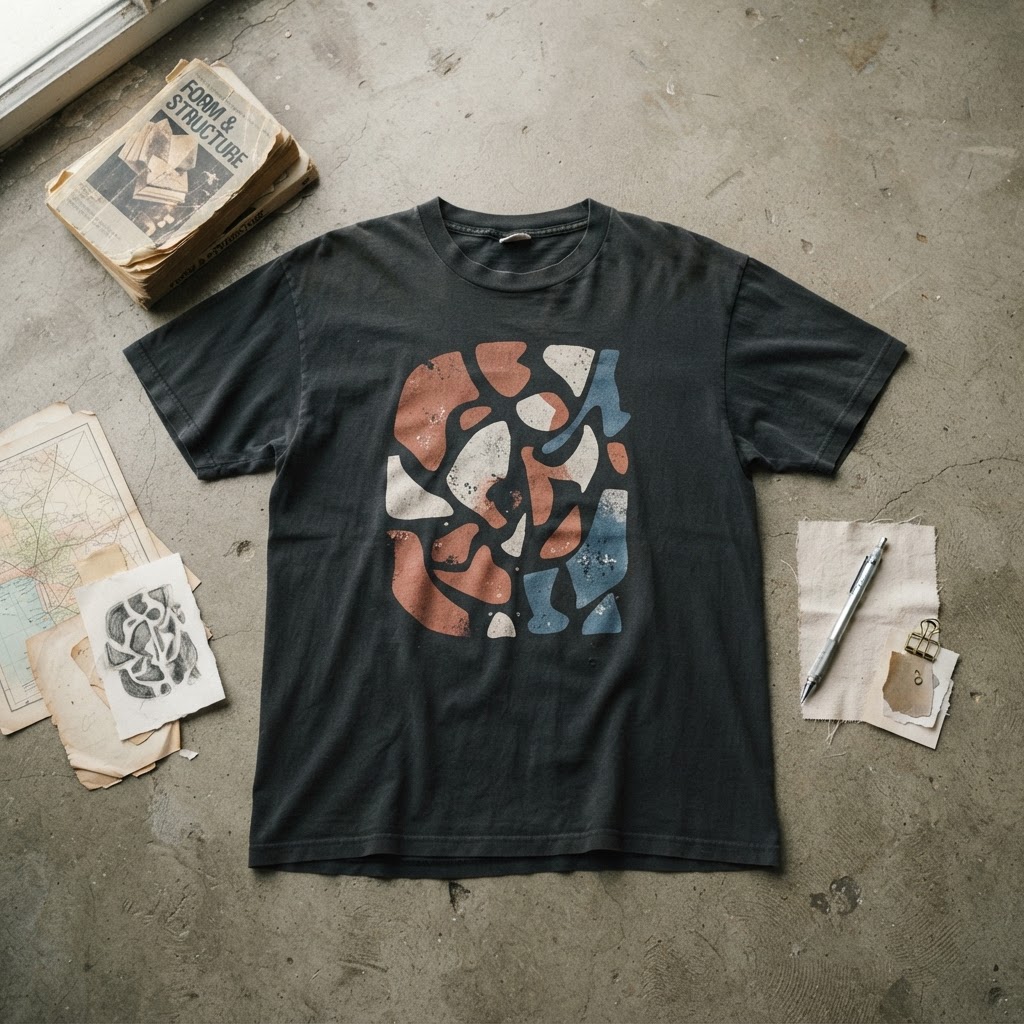
There's a particular kind of graphic that never fully disappears from the streetwear landscape. It resurfaces every few years in a new context — a different colour palette, a different silhouette, a different subculture claiming it as its own — but the bones are always the same. Retro car graphics occupy that rare territory. They are simultaneously masculine and universal, nostalgic and urgent, technical and emotional. They don't need explaining.
The appeal isn't really about cars. It never was. It's about what cars represented at specific moments in the twentieth century: freedom, danger, industrial optimism, counter-culture defiance. When those images land on cotton and hit the street, they carry all of that weight with them. The graphic tee becomes a compressed archive of attitude.
What's interesting right now is the particular flavour of automotive imagery that's resonating. It's not hypercar excess or Fast & Furious maximalism. It's older, quieter, and more considered — Japanese Kyusha culture, European endurance racing iconography, American muscle rendered in faded palettes that look sun-bleached and road-worn before they've ever left a warehouse shelf. The aesthetic is deliberate. The choices are precise.
The Cultural Roots of Automotive Imagery in Streetwear
To understand why car graphics work on tees, you have to go back further than most people bother. The connection between automobiles and youth culture was already established by the mid-1950s, when American hot rod culture created its own visual language — flame graphics, pinstriping, aggressive typography that owed as much to carnival signage as it did to the factory floor. This was outsider design before outsider design had a name.
By the 1970s, that visual language had migrated. You saw it on van murals, on album covers, on the backs of denim jackets. The car wasn't just transport; it was a canvas. The people customising these vehicles weren't thinking about streetwear — streetwear didn't exist yet — but they were doing the same thing that graphic tee designers do now: using a specific aesthetic vocabulary to signal belonging, taste, and defiance.
When streetwear emerged properly in the late 1980s and early 1990s, it absorbed this automotive tradition almost instinctively. Racing stripes appeared on tracksuits. Sponsor graphics from motorsport leaked into logo culture. The relationship between speed culture and street culture had always been there; streetwear just made it wearable in a new way.
What Makes Vintage Racing Iconography So Durable
Vintage motorsport graphics — particularly from European endurance racing and Japanese touring car championships of the 1970s and 80s — have a compositional quality that holds up remarkably well. The liveries were designed under strict constraints: maximum legibility at high speed, minimal colour separation for cost reasons, bold geometry that read clearly in both photographs and television footage. These weren't aesthetic choices made in pursuit of beauty. They were functional decisions that accidentally produced some of the most compelling graphic design of the twentieth century.
That accidental quality is part of the appeal. There's no pretension in a Gulf Oil livery or a Martini stripe. They weren't designed to be cool. They just were, and time has only intensified that. When you transfer that visual logic onto a tee, you're borrowing a legitimacy that can't be manufactured. It existed before irony, before hype cycles, before anyone thought to monetise nostalgia as a product category.
The best automotive graphic tees understand this. They're not recreating the livery slavishly — they're distilling it. Taking the essential geometry, the colour relationships, the typographic weight, and restructuring it into something that functions as a garment first and a reference second.
The Japanese Connection: Kyusha and the Quiet Obsession
No conversation about retro car graphics in contemporary streetwear is complete without acknowledging the enormous influence of Japanese car culture on the current moment. Kyusha — the Japanese term for classic cars, literally 'old vehicles' — has developed an aesthetic that feeds directly into the graphic tee market in ways that feel genuinely fresh.
Japanese collectors and designers approach vintage automobiles with a kind of reverent precision that produces graphic work unlike anything from the American or European traditions. The colour palettes are more restrained. The typography tends toward the technical — service manuals, inspection stickers, small-print specification sheets rendered large. The overall effect is cooler, less romantic, more architectural.
This aesthetic has spread outward from Japan through the usual channels — social media, niche magazines, the global network of people who care deeply about this stuff — and it's now visible across independent streetwear design. It suits the current moment well. After years of maximalism, there's appetite for graphics that reward close attention rather than demanding it from across the room.
Muscle Car Mythology and American Graphic Tradition
On the other side of the spectrum sits the American muscle car tradition, which operates with none of the Japanese restraint and all the more power for it. This is design rooted in mythology — the open highway, the V8 engine as existential statement, the whole vocabulary of American freedom that is simultaneously sincere and deeply ironic depending on who's wearing it and where.
The graphic language here is bolder, more aggressive, and more loaded with cultural meaning that cuts in multiple directions at once. A vintage Pontiac GTO rendered on a tee reads differently in Detroit than it does in London, differently on a sixty-year-old than it does on a twenty-two-year-old in East London. That instability of meaning is actually part of its appeal in streetwear. Graphics that mean different things in different contexts create space for the wearer to define the message.
Independent designers working with this material tend to be the most interesting because they're willing to complicate the mythology rather than just celebrate it. They're aware of the cultural complexity — the muscle car as freedom symbol, as masculine archetype, as American excess — and they work with that complexity rather than flattening it.
Why the Faded Palette Matters
One of the most consistent visual signatures across all retro automotive graphic work right now is the faded, worn-in palette. Colours that look like they've been through two decades of washing and sun exposure. Whites that are off-white. Reds that have shifted toward terracotta. Blues that have pulled toward grey.
This isn't just aesthetics — it's an argument about authenticity. The faded palette says: this isn't new. This has history. This existed before it became desirable. In a market saturated with freshness and newness, the graphic that looks worn already carries a different kind of authority.
It also solves a practical design problem. New-looking automotive graphics can easily tip into costume territory — like you're wearing a racing suit rather than a tee. The faded treatment creates distance. It signals that the graphic has been processed through time and taste, not just lifted directly from a reference image and screen-printed.
The best execution of this approach involves more than just desaturating colours. It's about understanding how materials actually age — how certain pigments fade faster than others, how cotton distorts and stretches slightly over years of wear — and building those qualities into the design from the start. That's the difference between a graphic that looks vintage and one that merely looks faded.
The Long Game: Why These Graphics Keep Returning
Street culture moves in cycles, but some visual languages persist across those cycles because they're tapping into something more fundamental than trend. Retro car graphics belong to this category. They keep returning because they're connected to durable human interests — speed, freedom, craftsmanship, rebellion — that don't expire.
What changes is the interpretation. Each generation finds a slightly different angle of entry. For one cohort it's the racing heritage. For another it's the Americana mythology. For another it's the Japanese precision of Kyusha culture. The underlying graphic vocabulary is flexible enough to absorb all of these readings.
For designers working in the independent streetwear space, this represents both an opportunity and a responsibility. The opportunity is obvious: a rich visual tradition with genuine cultural weight and proven market longevity. The responsibility is to bring something to it rather than just repeating it — to find the angle that makes the work feel alive rather than archival.
The tees that endure in wardrobes and in culture are the ones that understood this distinction. They weren't nostalgic in the passive sense. They were using history as a starting point for something that felt, despite all the vintage references, completely present.
From the Collection
The Red Girl Unisex t-shirt is available now in the T49 collection — a figurative design with its own kind of iconic energy: /product/454725761
Explore the drop →