Night Hunter: The Graphic Tee That Operates After Dark
What makes a dark graphic tee design work on cotton?
There's a category of graphic tee that works best in motion. Not on a hanger, not in a flat lay, not pinned to a mood board — but worn, moving through a city at 11pm when the light is sodium orange and the streets have thinned out. The Night Hunter Tee was designed for exactly that context. It earns its name.
This isn't a design about shock value or maximalist noise. It's something more considered than that — a piece that rewards a second look, that carries tension in its composition, and that understands the difference between darkness as aesthetic and darkness as atmosphere. There's a lot of graphic tees that go dark. Very few of them actually feel nocturnal.
The Night Hunter is one that does.
The Concept Behind the Graphic
The starting point for Night Hunter isn't a single reference — it's a feeling. That specific quality of night in an urban environment where predator and prey logic starts to blur at the edges. Cities after midnight operate on different rules. Visibility drops, instincts sharpen, and the casual softness of the daytime disappears entirely.
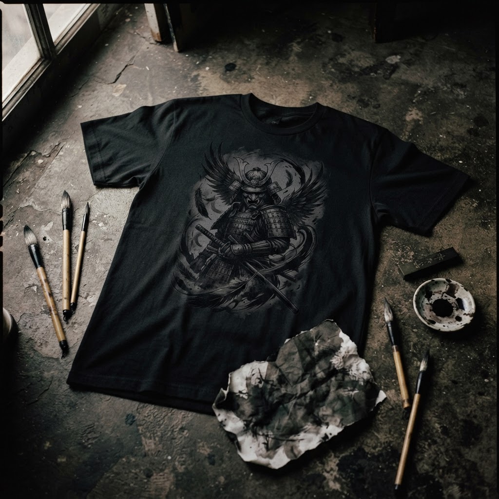
The graphic channels that shift. The imagery carries the weight of something watchful — a presence that isn't aggressive exactly, but is absolutely alert. The kind of energy that belongs to anything built to move in low light: owls, foxes, big cats, the lone figure crossing an empty intersection at 2am. Whatever the Night Hunter is, it isn't sleeping.
What makes the concept work graphically is restraint. The temptation with dark-themed design is to overload — to fill every inch with texture and shadow until the image becomes dense and illegible. Night Hunter avoids that trap entirely. The graphic breathes. Negative space is doing real compositional work here, letting the eye find the focal point naturally rather than being dragged there.
Why This Works on Cotton
Printed graphics have a specific relationship with fabric that digital design doesn't fully anticipate until you're holding the finished piece. Cotton absorbs ink differently depending on weight, weave, and wash. A design that looks razor-sharp on screen can lose its edge entirely on a fabric that's too soft, or feel harsh and rigid on something that needed fluidity.
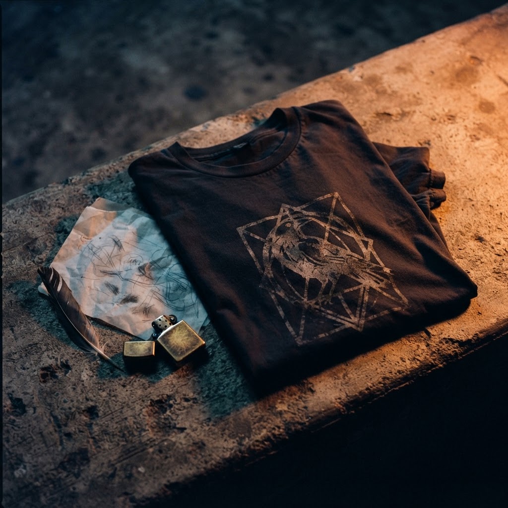
The Night Hunter graphic was built with that material reality in mind. The linework is confident without being fragile — thick enough to hold across washes, considered enough to read cleanly at chest scale. The tonal range doesn't rely on photographic gradients that would muddy with wear. Instead, the contrast is structural, baked into the composition rather than dependent on perfect print conditions.
There's something important about graphic tees that hold up over time. Not just physically — though that matters — but visually. A tee that looks exactly as interesting on its twentieth wear as its first is a design success. Night Hunter is that kind of piece. The aesthetic doesn't depend on newness.
The References It's Drawing From
Night Hunter sits within a lineage of nocturnal imagery that runs through multiple visual cultures without belonging exclusively to any one of them. There's something in it that echoes the woodblock tradition — the high-contrast, almost silhouette approach to natural subjects that Japanese printmakers perfected over centuries. There's also something that points toward Western naturalist illustration, the kind found in field guides and scientific prints from the 18th and 19th centuries, where accuracy and artistry were understood as the same project.
Beyond print traditions, the design draws on a broader cultural fascination with night creatures and hunting symbolism that cuts across folklore, mythology, and street culture alike. The owl as wisdom and omen. The wolf as pack intelligence. The hawk as precision. These aren't arbitrary — they're symbols that human cultures have returned to repeatedly because they encode something true about how we understand power, patience, and the dark.
The design doesn't lecture about any of this. It doesn't need to. The references are structural, not decorative. They inform the composition without announcing themselves.
Colour and the Absence of It
Colour choices in graphic tee design are often where the concept lives or dies. Night Hunter makes a deliberate decision about its palette that's worth examining — because the choice to go dark, or to strip back to near-monochrome, is never as simple as it looks.
The absence of bright colour here isn't about limitation. It's about environment. Nocturnal palettes are specifically desaturated — the human eye in low light loses its ability to distinguish colour and shifts to contrast and movement detection. Night Hunter works within that perceptual reality. The palette mimics the visual experience it's representing, which is a more sophisticated design move than simply choosing black because it looks cool on a tee.
There's also a wearability argument. High-contrast, dark-field graphics have extraordinary versatility in a wardrobe built around neutrals. The Night Hunter isn't competing with what's around it — it anchors an outfit without dominating it. That's harder to achieve than it looks.
What the Name Is Actually Doing
Names for graphic tees get treated as afterthoughts more often than they should. They're left vague, made generic, or chosen because they sound good in isolation without actually connecting to the visual. Night Hunter doesn't make that mistake — the name is doing specific work.
Hunter implies agency, patience, and purpose. Not violence — purpose. There's a significant difference in connotation between predatory aggression and the kind of focused, practiced pursuit that hunting actually represents. The best hunters are still. They wait. They understand the environment better than anything moving through it casually.
Night locates all of that in the specific temporal space where different rules apply. Night is when most of the world is disengaged, passive, offline. The night hunter is operating while everyone else has stepped out of the frame.
Worn on a t-shirt, that's a statement about attention and presence that feels genuinely relevant to street culture — where the hours after dark have always had a specific social and creative gravity. The clubs, the studios, the late sessions, the walks home through empty cities. Night culture isn't just an aesthetic. It's a real way of inhabiting the world.
The Tee as Object
It's worth being direct about something: the graphic tee is one of the most democratic and most underestimated objects in contemporary dress. It costs almost nothing to produce relative to other garments. It requires minimal technical skill to wear. And yet, when the design is genuinely considered — when someone has made real decisions about composition, reference, material, and meaning — a t-shirt can carry more cultural weight than garments that cost ten times as much.
Night Hunter is a piece that understands its form. It isn't trying to be something else. It's a graphic tee that takes the genre seriously, that treats the chest as a canvas with specific constraints, and that works within those constraints rather than ignoring them.
The result is something you'd actually reach for repeatedly. Not because it's loud, not because it demands attention, but because it's quietly, consistently right — for the late walk, the low-lit bar, the city after midnight when everything sharpens up and the people still moving through it know exactly what they're doing out there.
The Night Hunter Tee is available now at T49 — find it at /product/456133748. EXPLORE THE COLLECTION →