The Animal That Broke The Internet (And Why It Works On Cotton)
Why do animal graphics work so well on streetwear t-shirts?
There's a moment in streetwear when something tips from ironic to iconic. When a motif that should feel throwaway ends up on the back of someone genuinely cool, shot on a real street, shared without caption. Animal graphics have been having that moment — quietly, persistently — for about two decades now. And they show no sign of stopping.
The instinct is to dismiss them. Animals on t-shirts feel like the domain of novelty gift shops and discount racks. But look closer at what's actually moving in independent design circles, in Tokyo, in East London, in the better corners of the internet — and you'll find animal imagery doing some of the most interesting graphic work in the category. Not despite the subject matter. Because of it.
The question isn't whether animals belong on cotton. It's what the designer does with them when they get there.
Why Animal Motifs Have Always Lived In Streetwear
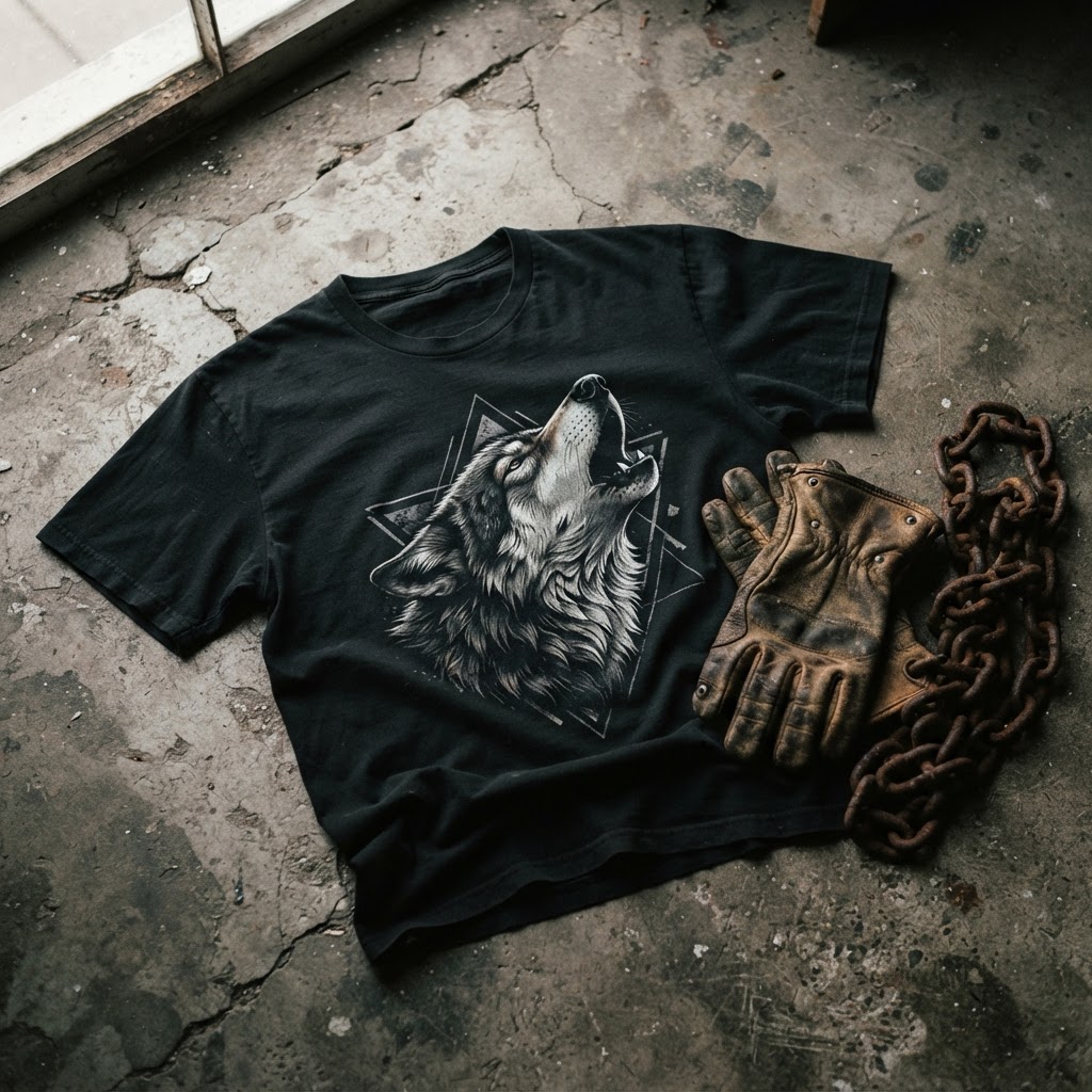
Streetwear has never been precious about its references. From the beginning, the genre pulled from wherever it wanted — military surplus, skate culture, hip-hop, Japanese workwear, vintage sportswear, underground comics. Animals fit naturally into that collage. They carry symbolism without requiring context. A wolf reads as fierce without explanation. A bear carries weight. A snake brings tension.
But the tradition goes deeper than aesthetics. In Japanese streetwear specifically — a scene that has shaped global taste more than almost any other — animal iconography has been central for decades. From the embroidered tigers of souvenir jackets to the koi and dragon motifs of brands working in the ura-Harajuku tradition, animals carry meaning, history, and craft. Western streetwear absorbed that influence and ran with it, stripping some of the symbolism but keeping the visual authority.
What's interesting is how the range expanded over time. It wasn't just apex predators. It wasn't just mythological beasts. Designers started finding visual tension in unexpected creatures — domestic animals, overlooked animals, animals that didn't fit the template of power or danger but brought something else entirely: personality, absurdity, a kind of knowing wit.
The Wit Principle: When Humour Is A Design Tool
There's a strain of graphic design — present in zine culture, in skate graphics, in the best independent tee design — that uses humour not as a softener but as a sharpener. A graphic that makes you smile first and think second lands differently than one that leads with concept. It gets past your defences. It earns its place on the chest before you've had a chance to intellectualise it.
This is where certain animal subjects do something that wolves and eagles can't. They bring irreverence. They signal that the wearer isn't taking themselves too seriously — which, paradoxically, reads as confidence. The streetwear community has always been alert to people who try too hard. A graphic that leans into its own absurdity, that executes something deliberately un-serious with genuine craft and care, carries a very particular kind of cool.
Pugs are not, on paper, a streetwear animal. They are the opposite of the established animal-motif hierarchy. They are round. They are wrinkled. They breathe loudly. And yet — in the hands of a designer who understands that the contrast between subject and execution is itself the point — they become genuinely interesting graphic material.
The visual of a pug rendered with the same compositional seriousness as a traditional wildlife print is quietly funny in exactly the right way. Not LOL funny. Knowing funny. The kind of funny that works on a tee because it doesn't announce itself. It rewards attention.
How Character Illustration Translates To Cotton
Not every image survives the move to fabric. This is something designers who come from digital or print backgrounds have to learn. Gradients flatten. Fine detail muddies. Colours shift under different light conditions. A graphic that works on screen can fall apart at arm's length on cotton.
Character-led illustration — particularly animal characters rendered with strong silhouettes and deliberate linework — tends to translate well for specific reasons. The silhouette does the heavy lifting. You read the shape before you read the detail. Good character design builds from that shape outward, making sure the graphic works as a shadow before it works as an image.
The best animal graphics in streetwear understand this. They're not photorealistic. They're not generic cartoon. They occupy a middle space — illustrative, considered, with enough personality to feel original and enough graphic clarity to read from across the room. That balance is harder to achieve than it looks. It requires genuine design thinking, not just a clever idea.
Texture matters too. The weight and weave of the cotton, the hand-feel of the print, the way the ink sits on the surface — these aren't afterthoughts. They're part of the graphic's presence. A flat, plasticky print on thin cotton changes how the image reads. The same graphic on a well-constructed tee, printed with care, feels different. It has depth. It feels like it belongs.
The Unisex Question And Why It Changes The Brief
Designing for a unisex garment isn't just a matter of cutting wider or going with a looser fit. It changes the design brief at a fundamental level. A graphic made for a unisex tee has to work across different bodies, different ways of wearing, different contexts. It can't rely on gender-specific styling codes to carry its meaning.
Animal graphics — particularly character-led ones — handle this well. They're not coded masculine or feminine in the way that some graphic categories are. They sit outside those conventions. A strong illustration that leads with character rather than symbolism or aggression tends to feel open in the right way. It doesn't require the wearer to subscribe to a particular identity to make the graphic work.
This is increasingly how the best unisex design operates. Not gender-neutral in the sense of being bland or inoffensive, but genuinely open — legible and interesting across different contexts without losing its point of view. That's a harder brief than designing for a specific demographic. The graphic has to carry its own weight without leaning on external codes.
Independent Design And The Value Of Taking The Unexpected Seriously
One of the things that separates genuinely interesting independent design from the broader noise of printed apparel is the seriousness with which unexpected subjects get treated. It's easy to default to proven territory — the skull, the mountain, the abstract geometric. These work. They've always worked. But they also accumulate into a kind of visual fatigue.
The more interesting question is what you do with the subject matter that doesn't obviously work. The animal that doesn't belong on a streetwear tee. The creature that sits outside the approved hierarchy of cool. Taking that subject and executing it with real craft — compositional thought, typographic restraint, genuine illustration skill — is where the unexpected becomes the memorable.
This is where independent brands can do something that larger operations can't. A brand that doesn't have to answer to quarterly trend reports can make the call to put a pug on a tee and commit to it fully. To make the execution so considered, the balance of wit and craft so exact, that the finished graphic earns its place. That's not a safe move. But streetwear has never rewarded safe moves.
The pieces that last — that end up in the back of wardrobes for years and still feel right when you pull them out — are usually the ones that felt slightly unexpected when they first appeared. Not shock-value unexpected. Not random. Unexpected in a way that turns out to have internal logic, once you've lived with it.
The best animal graphics work exactly like that. Surprising at first glance. Inevitable in retrospect.
The Pug Unisex t-shirt is available now in the T49 collection — find it at /product/454725023. EXPLORE THE COLLECTION →