Born to Ride, Built to Last: The Return of Vintage Motorcycle Tees
Why are vintage motorcycle tees coming back in streetwear?
There's a particular kind of graphic tee that feels like it's been through something. Faded ink, a chest print that's cracking at the edges, a design that references a world with its own codes and rituals. The vintage motorcycle tee is that garment — and right now, after years of clean minimalism and ironic slogan prints dominating the conversation, it's coming back hard.
This isn't nostalgia for nostalgia's sake. The best revivals are never that. What's happening with moto-influenced graphic design is more interesting — it's a recalibration toward work that carries genuine weight, imagery with a lineage, references that reward the people who actually know.
Street culture has always been good at this. It reaches back, pulls something out, and makes it new without apologising for where it came from.
Where the Imagery Comes From
The visual language of motorcycle culture is one of the richest in twentieth-century American folk design. Club patches, dealer tees, race event shirts, custom shop merch — each one carries a graphic vernacular that developed entirely outside fine art and fashion. It was functional, regional, and deeply tribal. You wore the shirt to signal belonging.
The iconography that emerged from that world — wolves, eagles, flames, skulls, mechanical lettering, gothic script, dense illustrative badges — wasn't designed to be cool. It was designed to mean something specific to a specific group of people. That authenticity is exactly what makes it so compelling to designers working in street culture now.
When you strip away the kitsch and engage with that imagery seriously, you find something with genuine graphic power. The compositions are bold. The symbolism is layered. The execution, at its best, is meticulous — hand-drawn, deeply considered, built to survive being screened onto cotton and worn until it falls apart.
The Aesthetic of Wear
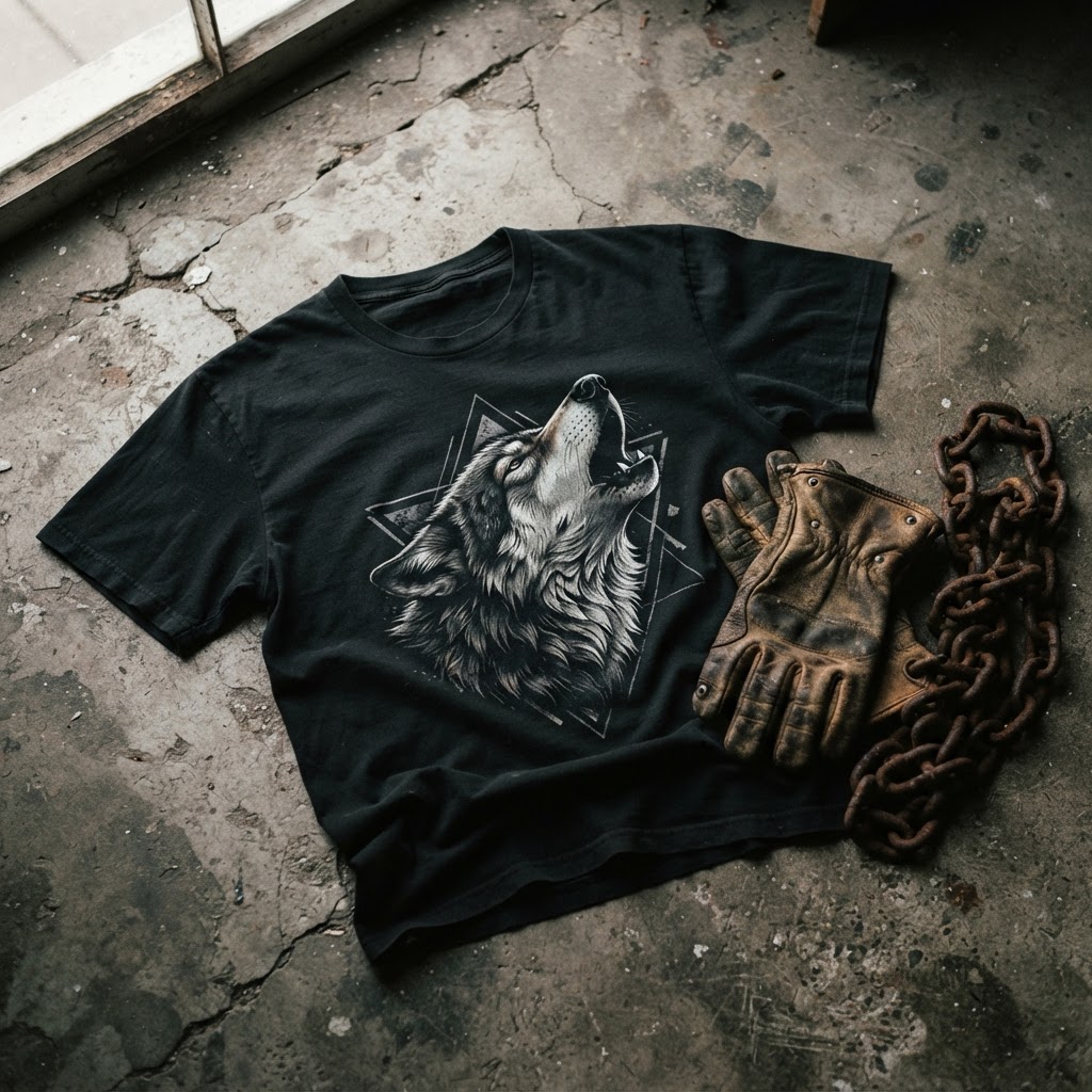
One of the defining qualities of the vintage moto tee revival is its relationship with age. The look isn't pristine. The whole point is that something should feel like it's lived a life — distressed prints, faded blacks that shift toward charcoal and grey, ink that's settled into the fabric rather than sitting on top of it.
This is a direct counter-move against the overly clean, algorithmic aesthetic that dominated streetwear through the late 2010s. Drop culture produced a lot of technically impressive, graphically sterile garments. Things designed to photograph well on white backgrounds. The moto revival is the opposite of that — it's interested in patina, in texture, in the suggestion of a history that predates the piece you're holding.
For graphic designers working in this space, that creates an interesting brief. How do you design something that looks aged without looking fake? How do you reference a tradition without doing a straight pastiche? The best work in this area sits in that productive tension — new enough to feel intentional, worn enough to feel earned.
Wolves, Predators, and the Animal Iconography of the Road
If you look at the motifs that recur most consistently in classic motorcycle graphic design, animals dominate. Eagles were the American standard — national symbol, predatory, airborne. But wolves were always there too, carrying a different kind of energy. Pack loyalty, nocturnal, associated with wildness that isn't domesticated by symbolism the way the eagle is.
The wolf as a graphic icon has a specific resonance in moto culture. It's not a mascot or a brand animal — it's a statement about how the wearer understands themselves in relation to the world. Independent. Alert. Part of a group but not subservient to it. There's a reason wolf imagery survived every era of the moto tee and keeps returning in serious street design work.
Designers who engage with that iconography honestly — not as a shortcut to edge, but as a genuine visual language — produce work that lands differently to trend-driven graphic output. The T49 Wolves Tee sits in that tradition: predator imagery handled with the kind of craft and intention that gives it staying power beyond the current revival moment.
How Subculture Graphic Work Enters the Mainstream
The route from subculture to streetwear mainstream is rarely a straight line. It usually involves a decade or more of underground visibility — the garment or aesthetic being worn by people who actually live inside the culture — before it gets picked up by designers who engage with it seriously, and then, eventually, by the broader market.
Motorcycle culture's graphic vocabulary had its mainstream crossover moments before. The 1990s saw a wave of biker-adjacent aesthetics move through rock and metal-adjacent streetwear. But that moment was more about surface signalling than genuine design engagement. The current revival feels different because it's coming from designers who are actually studying the source material — looking at club patch construction, understanding why certain compositions work, treating the reference with real respect.
That distinction matters enormously to how the work lands. A tee that references moto culture because it's currently trending looks hollow within eighteen months. A tee that engages with the visual language because the designer genuinely finds it compelling and technically impressive has a different lifespan entirely.
The Construction Question
Any serious conversation about vintage moto tees has to include the physical object. The originals weren't premium garments in the contemporary sense — they were workwear-adjacent, built to survive actual use. But the cotton weights were often substantial, the construction honest, and the relationship between garment and print carefully considered because the print was the point.
The current revival has inherited that seriousness about materials. Designers working in this space understand that a heavyweight cotton changes how a print behaves — it sits differently, ages differently, holds ink differently. The choice of fabric isn't separate from the graphic design decision; it's part of the same conversation.
This is where independent design brands have a genuine advantage over fast-fashion operations trying to chase the aesthetic. When you're making a smaller run with full control over materials and execution, you can make those considered decisions. The garment can actually be what it's trying to look like.
What the Revival Tells Us About Where Streetwear Is Going
Fashion cycles get discussed as if they're arbitrary — hemlines and silhouettes moving for no reason beyond the industry's need to keep selling. But the best streetwear movements have always been responses to something real. A shift in mood, a reaction against a dominant aesthetic, a reclamation of visual territory that got flattened by commercialisation.
The vintage motorcycle tee revival is a response to years of clean, ironic, deliberately uncommitted graphic design. It's a turn toward work that takes a position — imagery that comes from somewhere specific, references that aren't neutral, designs that require the wearer to be okay with carrying some weight.
That's a healthy direction for street graphic design. The tee as a vehicle for genuine visual culture rather than as a billboard for a brand's mood board. The moto revival, at its best, is making the argument that a graphic tee should mean something — not in a heavy-handed way, but in the quiet, earned way that good design always does.
The people who understand that have always been the ones making the most interesting work. They were making it when motorcycle tees were just motorcycle tees, before anyone called it streetwear. And they're making it now.
The Wolves Tee is available now in the T49 collection — /product/457935725 EXPLORE THE COLLECTION →