The Loud Tee, The Quiet Outfit: Wearing Bold Graphics Without The Noise
How do you wear a bold graphic tee without the outfit looking too busy?
There's a version of wearing a graphic tee that goes wrong in a very specific way. You can spot it immediately — everything on the person is competing. The tee is loud, the trousers are interesting, the shoes are a whole conversation, and somewhere in the middle of all that noise, the actual design gets lost. The piece that was supposed to matter most ends up invisible.
The problem isn't the tee. It's rarely the tee. The problem is that most people style a bold graphic as though it needs backup, when what it actually needs is space.
This isn't about dressing down or playing it safe. It's about understanding how visual weight works — and using that knowledge to build an outfit where the graphic lands with the kind of quiet authority that turns heads without demanding them.
Understand What The Graphic Is Already Doing
Before you build any outfit around a bold print, you need to actually look at the design. Not glance — look. What's the dominant colour? Where does the eye go first? Is the composition centred and contained, or does it bleed across the chest with energy and movement?
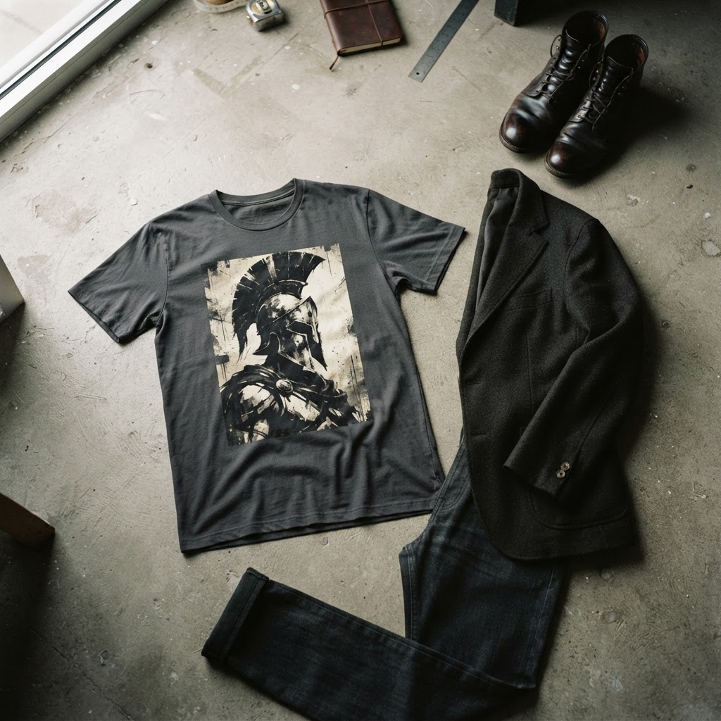
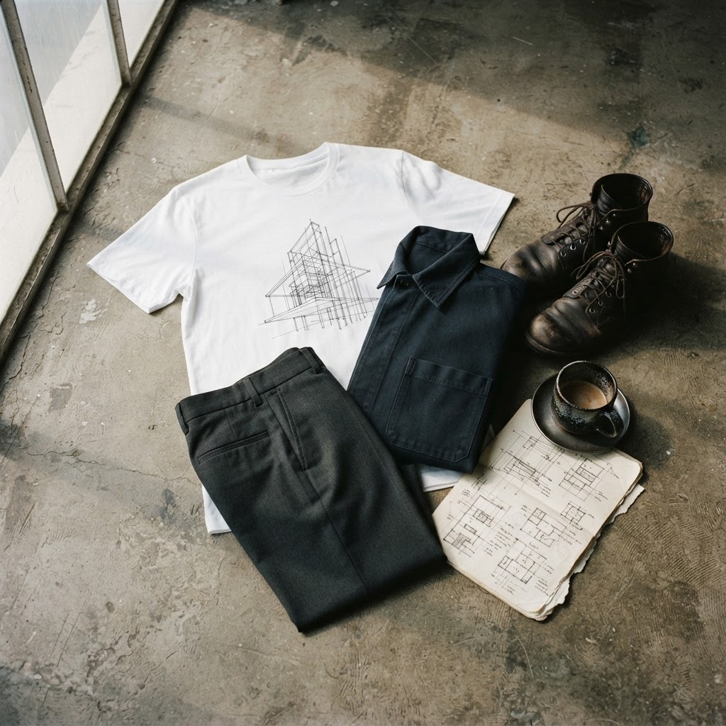
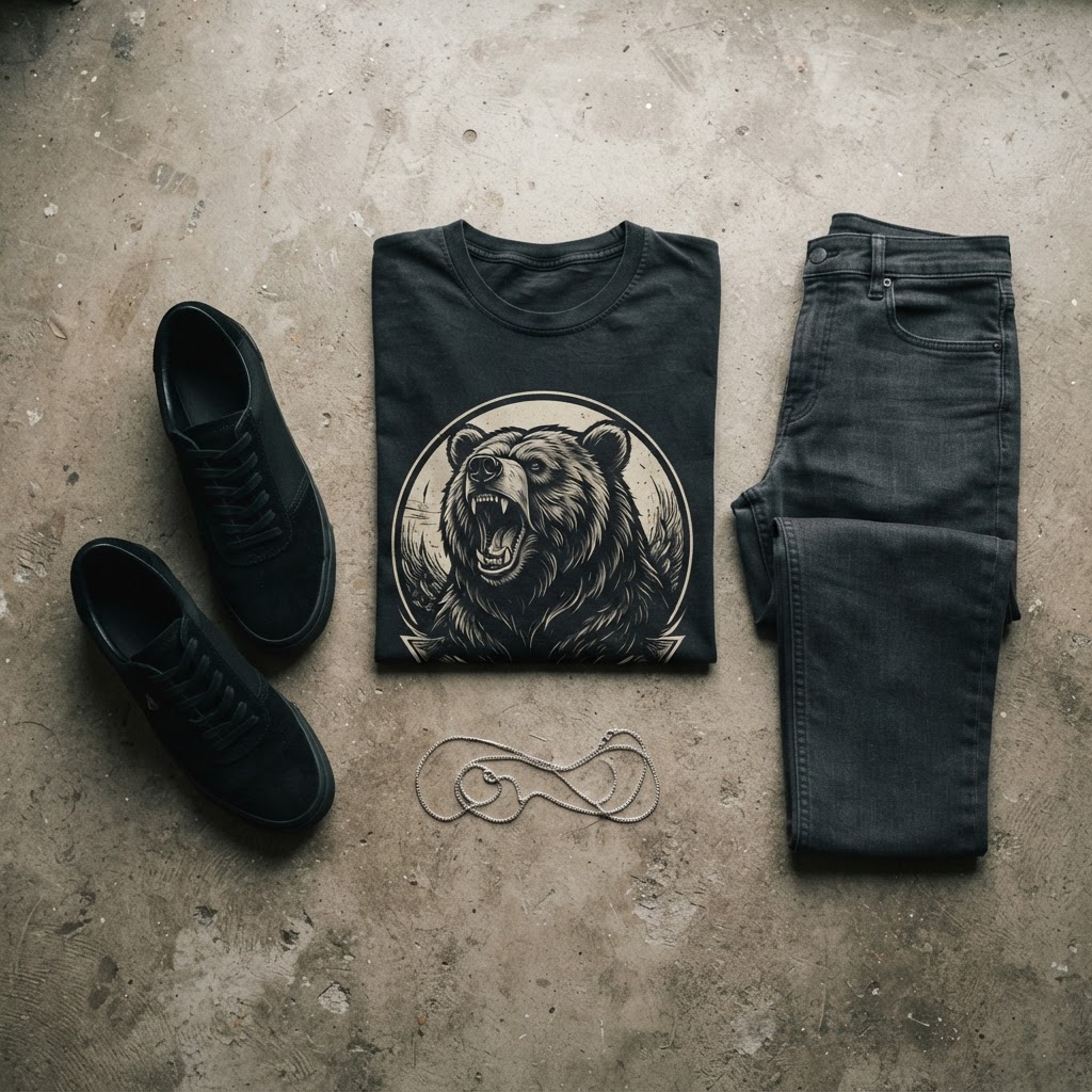
A tee like the Boarpower Unisex t-shirt, for example, carries real visual mass. The illustration is dense, deliberate — the kind of print that has a point of view baked into it. That's a different proposition from a tee with a small chest logo or a washed-out vintage print. Dense, high-contrast graphics want stillness around them. Lighter, more graphic-linear designs can hold their own next to slightly more textured pieces.
Knowing this changes everything about how you shop for the rest of the outfit. You're not just picking clothes you like — you're making editorial decisions about what gets airtime.
The One-Colour Rule For Bottoms
If the tee is doing significant visual work, the trousers, shorts or skirt should effectively disappear. That doesn't mean they're unimportant — it means they're doing a different job. They're the frame, not the painting.
The most reliable approach is a single, unbroken colour that either echoes one tone from the tee or sits in deliberate neutral territory. Black, slate, ecru, stone, washed navy — these are the working wardrobe of anyone who takes graphic tees seriously. They don't pull focus. They create a visual floor that lets the print above it breathe.
Where people go wrong is reaching for patterned trousers, heavily distressed denim with contrast stitching, or anything with a competing graphic element — even a subtle one. A small logo on the thigh of your cargo pants sounds inconsequential. It isn't. When you're wearing a large-scale print on top, every other visual detail below the waist registers as friction.
Tailored trousers in a mid-tone grey or straight-cut black jeans with minimal detailing are, genuinely, the move. Not because they're the safest option — because they're the most intelligent one.
Footwear: The Easiest Place To Get It Wrong
Shoes have strong personalities. They're the most culturally coded item in any outfit, and they carry enormous stylistic weight even when they're not trying to. Chunky skate shoes, high-fashion trainers, heavily branded sneakers — these all have opinions. And when your tee also has opinions, you end up with an argument instead of an outfit.
The logic here is similar to the one-colour rule for bottoms: the footwear should either be visually quiet or precisely, intentionally chosen to rhyme with the tee. A clean white low-profile trainer — not a maximalist running shoe, a genuinely clean silhouette — works with almost any bold graphic because it doesn't interrupt. Black boots, particularly a Chelsea or a slim-cut combat, do the same job while adding a slight toughness that suits darker, more graphic designs.
If you do want footwear with presence, it has to earn its place. That means pulling a specific colour from the graphic, not just vibing in the same general territory. Precision matters here. If the dominant tone in your print is a particular shade of rust or olive, finding a boot or trainer in that exact colour creates a visual loop that feels considered rather than accidental.
Layering Without Competing
Layering over a graphic tee is where the conversation usually goes sideways. The instinct — particularly in transitional weather — is to reach for whatever jacket is closest. But outerwear has a silhouette, a texture, a closure system, and often a colour. All of that is in conversation with the tee underneath.
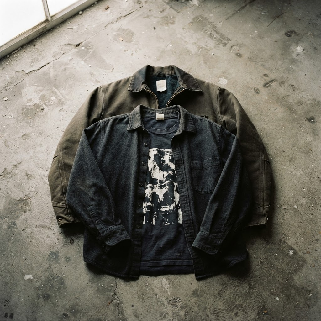
The simplest rule: open layering only. An overshirt left completely unbuttoned, a lightweight jacket worn open, a coach jacket unzipped. As soon as you close the layer, you hide the print — which defeats the entire point. Open layering frames the tee rather than obscuring it, and the visual read from the front remains clean.
For outerwear colour, the same logic applies as with bottoms. Neutral or tonal. A black overshirt over a predominantly dark graphic is almost invisible in the best possible way — it adds structure and depth without noise. A washed olive coach jacket over a tee with green or earth tones creates a cohesive envelope around the whole outfit.
Where this gets interesting is with slightly oversized outerwear worn fully open. The graphic becomes a focal point in a way that feels almost gallery-like — the larger garment creates peripheral structure that directs the eye inward. It's a genuinely strong way to wear a tee you care about.
Accessories: Restraint Is The Whole Strategy
If the outfit is built correctly around the tee, accessories should be almost invisible. This isn't minimalism for its own sake — it's visual editing. Every additional element is a potential distraction, and distraction is the enemy of a print landing properly.
A watch, if worn, should be simple. A chain, if worn, should be fine-gauge and not long enough to bisect the graphic. A bag should be carried or worn in a way that doesn't obscure the chest print — a crossbody at the hip, a tote over one shoulder, a backpack obviously at the back.
Hats are the exception to the restraint principle, because they sit above the graphic rather than competing with it. A simple beanie in a tonal colour, or a plain cap in black or washed cotton, frames the face and adds a street-level context without taking anything away from the tee. It actually works in the design's favour, reinforcing the register — this is a person who thinks about what they're wearing.
What to avoid: stacked rings if the tee already has a lot happening, printed scarves, any accessory that has its own graphic or slogan on it. The goal is a singular visual focus. Everything either supports that or gets cut.
Fit: The Underrated Variable
Fit affects how a graphic is perceived more than most people realise. A tee worn slightly oversized, with a hem sitting at the hip and sleeves hitting mid-bicep, turns the graphic into a canvas — the design reads as a considered print on a considered silhouette. The same tee worn too tight distorts the graphic and shifts the whole visual register. Too oversized, and the print loses its shape entirely, particularly at the neckline and shoulders.
The sweet spot for most bold graphic tees is a relaxed fit that maintains the integrity of the print. Shoulder seams should sit at or just past the shoulder point. The chest should have room to breathe without the fabric pulling. Length should be enough to tuck slightly or wear out without looking overly long.
This is especially important for unisex cuts, which are designed to work across a wider range of bodies by leaning into that relaxed silhouette deliberately. Trust the cut. The designer almost certainly made decisions about how the print would sit on the body when worn as intended. Working against the intended fit usually means working against the design.
The Final Read: Distance And Proximity
Here's the test that most people skip: stand back from the mirror. Not the close-up assessment of whether the collar sits right — the actual read you get from across a room, the way another person will see you in the first two seconds.
At distance, a well-constructed outfit built around a bold graphic does one thing: it shows you the tee. Not the tee plus the trousers plus the shoes plus the jacket. The tee. Everything else has receded. The graphic is doing what it was designed to do — communicating clearly, landing with intent.
If you step back and your eye goes anywhere other than the print first, something in the outfit is competing. Find it and simplify. That's the whole discipline. It's not complicated, but it does require honesty about what you're looking at — and the patience to edit until what you're looking at is exactly what you intended.
The Boarpower Unisex t-shirt — a dense, high-impact graphic with real visual presence — is available now at T49: /product/453548269 EXPLORE THE COLLECTION →