The Loud Tee, The Quiet Outfit: A Study In Contrast
How do you style a loud graphic tee without the outfit looking too busy?
There's a specific kind of styling mistake that gets made constantly — someone pulls on a heavy graphic tee, then layers on patterned trousers, a printed overshirt, and a cap covered in logos. The result isn't confident. It's chaotic. The eye has nowhere to land, nothing to anchor to, and the piece that was supposed to carry the look gets buried in its own company.
The logic of dressing around a loud graphic is the same logic a good film director understands: the most dramatic moment in a scene works because everything around it is quiet. The cut away. The held breath. The blank space that makes the thing you're pointing at actually land.
This isn't minimalism as an aesthetic — it's restraint as a tool. And once you understand it, the most complex, saturated, visually ambitious graphic tees become some of the easiest pieces to dress around.
Start With The Tee, Then Stop Adding
The first instinct when building an outfit is additive. Hat, bag, jacket, layers — you keep reaching. But when the tee is already doing significant visual work, every addition is a negotiation. Most of them you'll lose.
Pick your graphic first. Understand what it's doing — is it painterly, typographic, figurative, abstract? Is it high-contrast or tonal? Does it fill the whole chest or occupy a defined area? The answers tell you what kind of silence the surrounding pieces need to create.
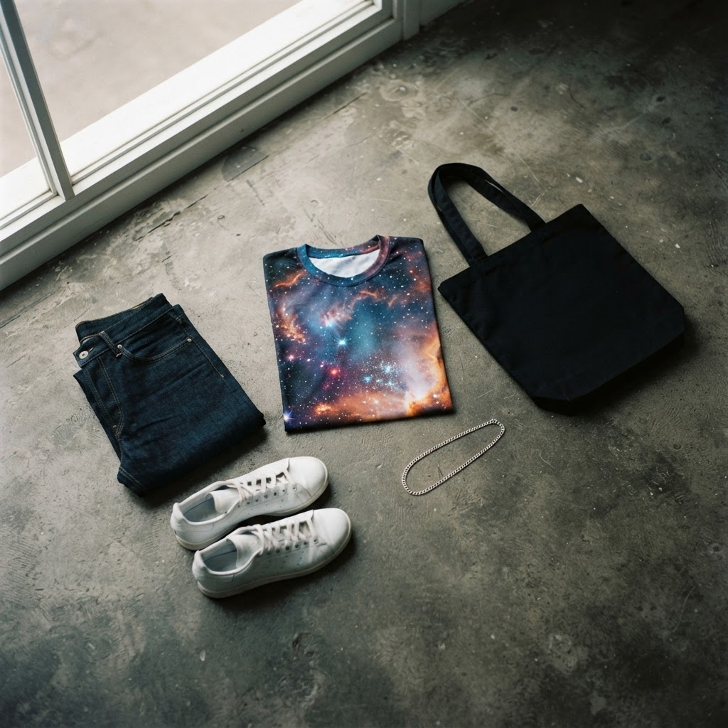
A tee like the DJ Galaxy Unisex t-shirt — dense, cosmically saturated, with an image that rewards looking at — asks for almost nothing else. The design is doing the work. Your job is to not interfere with it.
Once you've made that first reach for the additional piece, ask yourself whether it adds visual information or subtracts it. Usually, it adds. Usually, that's the wrong call.
Bottoms: The Case For The Non-Decision
If the tee is carrying the look, the trousers or shorts should be as close to a non-decision as possible. Not boring — a non-decision. There's a difference.
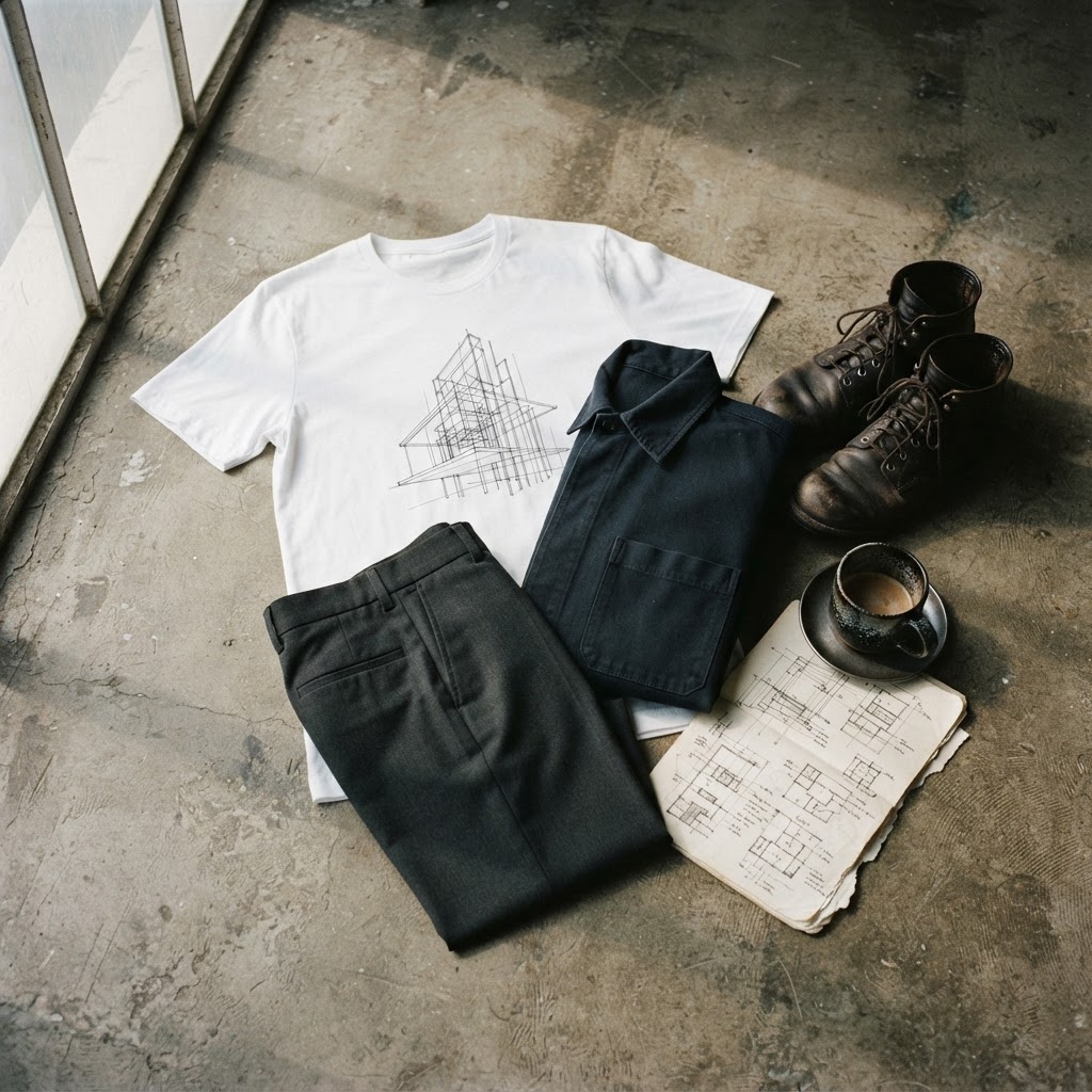
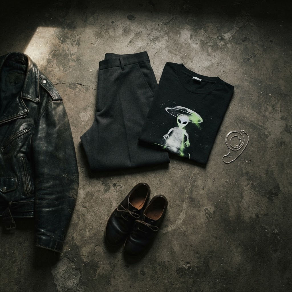
A well-cut pair of black straight-leg trousers reads as intentional without contributing noise. So does a washed-out grey cargo pant with clean lines, or a pair of dark-rinse jeans with no distressing, no fading, no embellishment. The cut still matters — proportion still matters — but the surface is calm.
Where people go wrong is opting for "interest" in the bottom half when there's already maximum interest in the top. Two focal points at different heights don't coexist. One of them dominates, usually at the cost of the other looking accidental.
If you want to wear the heavily patterned trousers, the graphic tee is not the companion for them. That's a different outfit with a different anchor. Know which piece you're building around before you start.
Outerwear: When To Cover It And When To Leave It Alone
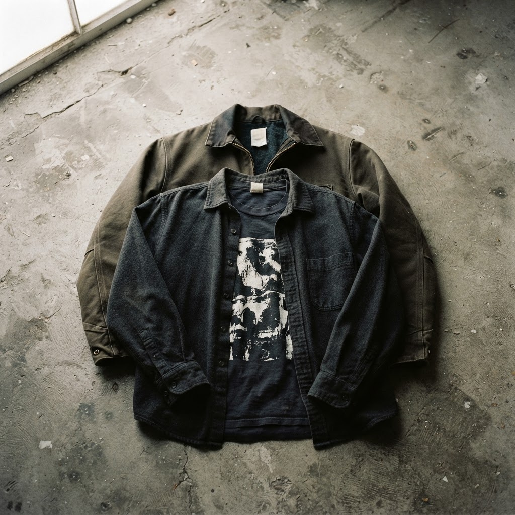
Layering over a loud graphic tee is a high-risk move that rarely pays off. The instinct makes sense — an open overshirt or jacket seems like it would frame the tee nicely — but in practice it usually cuts the graphic in half, bisects the composition, and turns a unified image into a cropped fragment.
The cleaner approach is to treat the tee as the outermost layer in warmer conditions, or to commit to a jacket that sits completely open and doesn't drift closed. The rule is simple: either the graphic is fully visible, or it's completely covered. Anything in between is a compromise that satisfies neither.
For colder weather, a heavy unstructured coat in a single neutral tone — charcoal, camel, black — worn fully open works well. The coat functions as a frame rather than a layer. It adds weight and structure to the silhouette without interrupting the design underneath.
Avoiding: denim jackets with graphic patches, hoodies worn open underneath, anything with visible logos or branding that competes for attention. The graphic tee doesn't need backup. It needs space.
Footwear: Grounding Without Competing
Shoes are where a lot of loud-tee outfits come undone. A visually complex trainer with a multi-panelled colourway, visible tech, and chunky tooling introduces a second area of intense visual interest at the opposite end of the body from the tee. The eye doesn't know where to go.
This isn't a case against good footwear — it's a case for footwear that does its job quietly. A clean white low-profile trainer. A plain black suede low-top. A simple leather boot in black or dark brown. These choices let the foot anchor the silhouette without fighting for attention.
Colour-wise, pulling a single colour from the graphic — not the loudest one, a background or secondary tone — and echoing it in the shoe creates coherence without being matchy. It's the kind of detail that reads as considered to people who notice these things, and invisible to people who don't. Both outcomes are correct.
Accessories: The Discipline To Leave The Bag Empty
The harder the graphic, the more discipline the accessories require. Which often means: very few, or none.
A good watch or a single piece of jewellery — a chain at a length that doesn't interfere with the neckline, a ring, a bracelet — sits below the threshold of noise. These are textures on the person rather than visual information. They're fine.
What doesn't work: a cap with a logo that competes with the chest graphic, a chain so large it overlaps the design, a bag with its own visual presence worn in a way that covers or intersects the tee. Any of these introduces a negotiation you'll lose.
The bag, if you're carrying one, should be as neutral as possible — a plain canvas tote, a minimal crossbody in a single tone — and worn in a way that doesn't drape across the graphic. Shoulder bags worn on the back when you're walking, switched to the side when you stop. Small adjustment, significant result.
Reading The Room: When The Quiet Approach Becomes A Full Fit Language
There's a version of this that goes beyond individual outfit decisions and becomes a consistent way of dressing. When you regularly build looks around graphic tees using quiet surrounding pieces, you start to develop an eye for the grammar of it — what serves the image and what competes with it.
The result is a visual confidence that doesn't come from having a lot of pieces. It comes from understanding how each piece functions in relation to a focal point. A tight, considered outfit with one strong graphic reads better — and takes less — than a layered outfit trying to do ten things at once.
The graphic tee, in this context, stops being a casual piece and becomes something closer to a centrepiece. Not dressed up — dressed around. The distinction matters. Dressing something up implies the original wasn't sufficient. Dressing around it acknowledges that it's exactly sufficient, and that everything else is in service of letting it do what it does.
That's the real discipline here. Not restraint for restraint's sake, but restraint in service of something. The graphic earns the space around it. Your job is to provide that space, and then get out of the way.
The DJ Galaxy Unisex t-shirt — the kind of piece this whole approach was built for — is available now at /product/453726342. EXPLORE THE COLLECTION →